Quantifying Intuition
Describing optical adjustments as mathematical functions
Design is often perceived as an entirely subjective practice. Indeed, in any given layout, a designer may make hundreds of optical adjustments to make it look “correct” to the eye. Type designers, for example, deliberately deviate from strict geometry to improve visual balance across an entire glyph set.
To be concerned with how the eye perceives these details may seem overly fussy, but these refinements remove the visual noise that might otherwise make the eye work harder to understand what it sees.

Shown as filled shapes, the letters O and A appear smaller than M despite sharing the same height.

O and A should extend slightly above and below M so they all appear to have the same height.

Horizontal lines appear visually heavier than vertical ones of the same weight (left); for letters like T, horizontal lines are typically thinned to correct this optical illusion (right).
Reducing visual noise is particularly important for digital products where users must accomplish complex tasks. However, manually making hundreds of optical refinements for different screen sizes and contexts would be impractical. Instead, how might these individual adjustments extrapolate into mathematical functions that design systems can ingest?
It makes sense to consider typography first since much of what makes typography “good” is determined mathematically. For example, letter spacing, or tracking, is typically loosened at smaller text sizes to avoid the visual crowding of letters. At larger sizes, text is tightened so the eye jumps shorter distances between letters while reading. The exact amount of letter spacing depends on the text size, and variable font files sometimes contain this data to make these adjustments automatically to a layout.
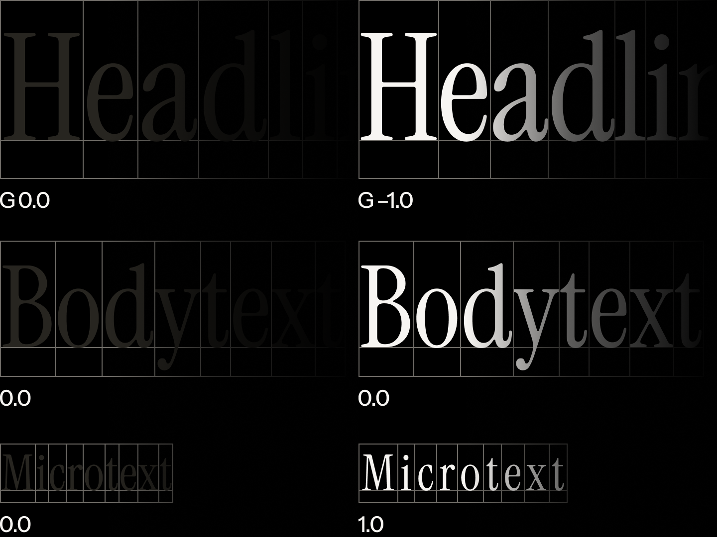
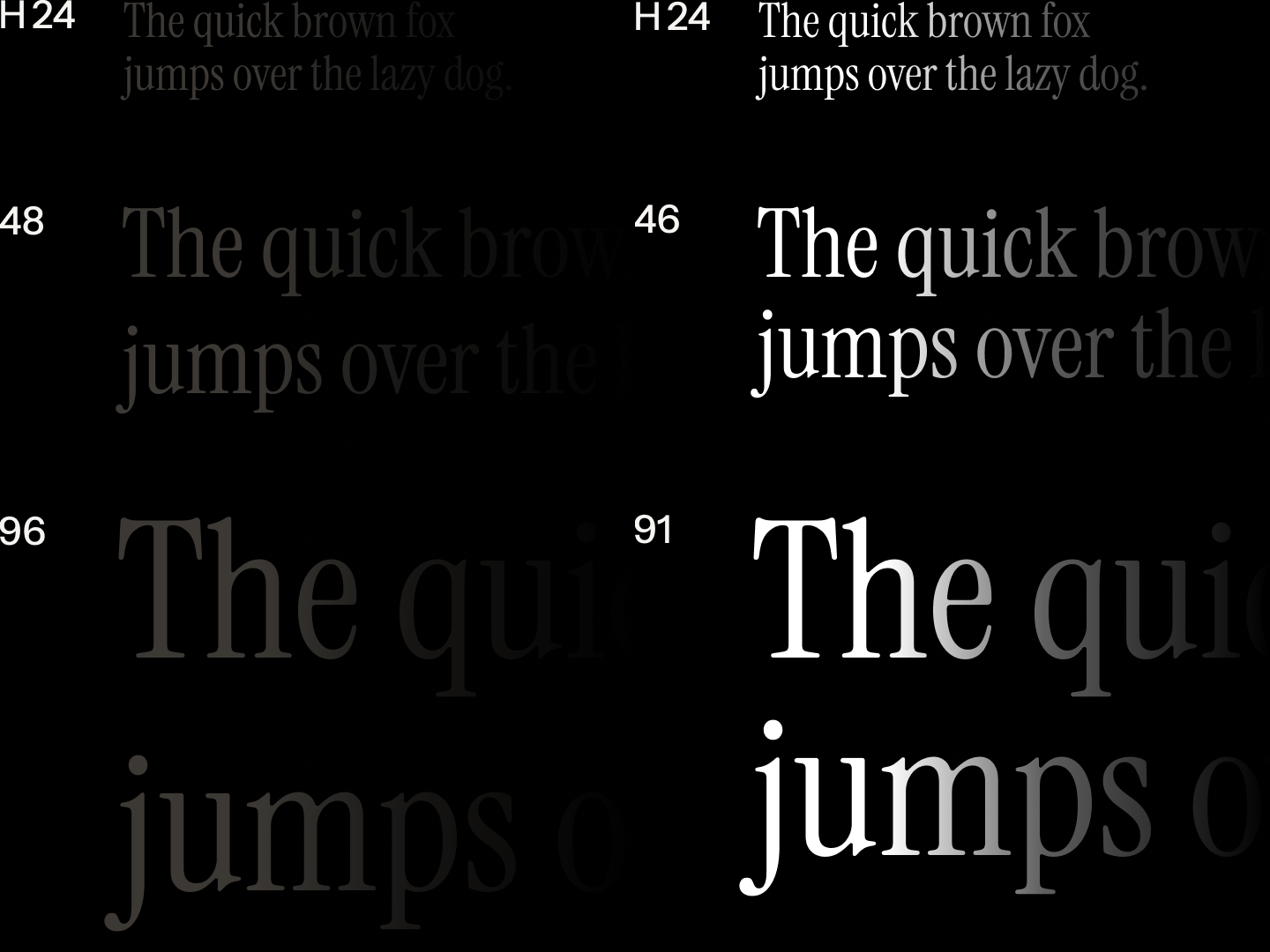
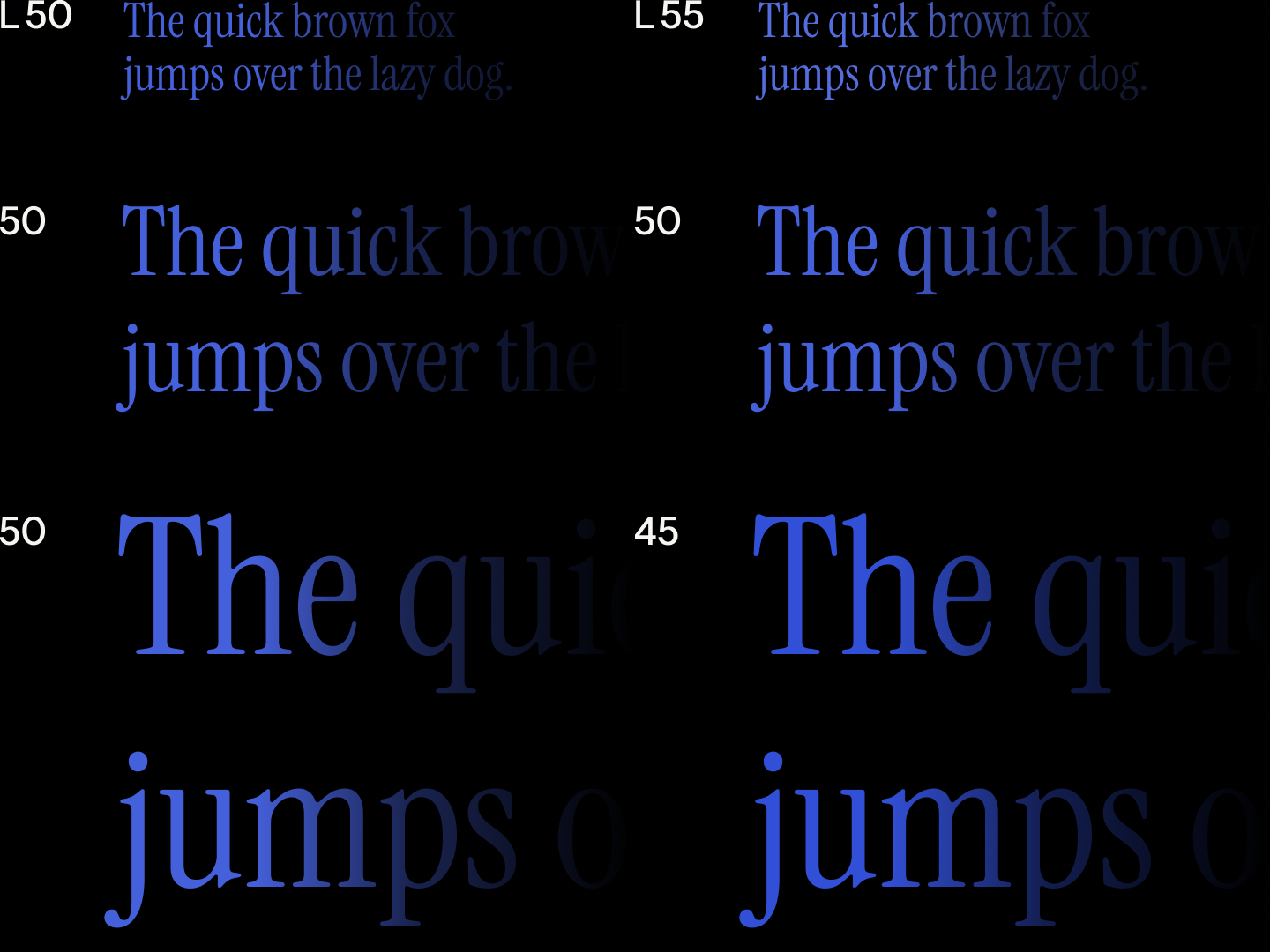
Without adjustments to its letter spacing g, expressed as a percentage, headings and micro text appear too loose and tight, respectively (left); letter spacing must be adjusted to improve readability at any given text size (right).
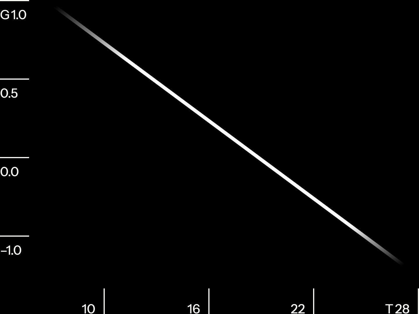
The optical corrections to letter spacing can be described as a linear relationship, with letter spacing g declining at a constant rate as text size t (in pixels) increases.
Not all optical corrections to text can be handled by a variable font file. For example, line spacing, or leading, could instead be referenced in reusable design system tokens, like in Morningstar Design System. Like letter spacing, line spacing is typically looser for smaller text sizes and tighter for larger ones.
If line height h (in pixels) increases at the same rate as the text size, it appears disproportionately loose at larger sizes (left); adjusting line height gives the appearance of similar line spacing at any given size and improves readability (right).
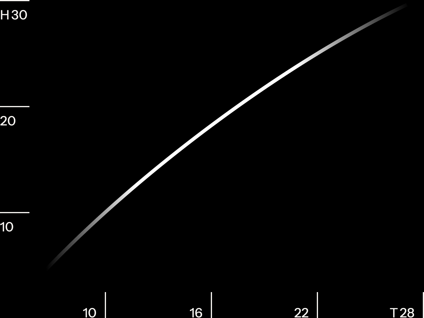
The optical corrections to line spacing can be modeled as a power-law function, with line height h (in pixels) growing quickly at first as text size t (in pixels) increases.
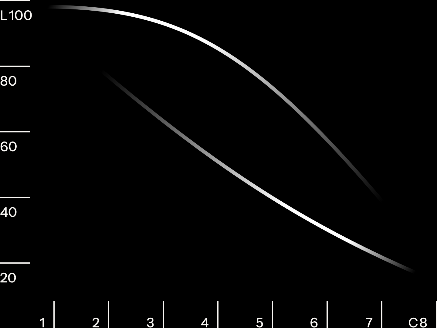
The color of text, too, should be considered as text size changes. Typically, for a given value, a color appears optically less intense at smaller text sizes and more intense at larger ones. Perceptually uniform color spaces, like Oklab, better represent how the eye perceives color, and its lightness, chroma, and hue settings can be adjusted mathematically to ensure text appears uniformly intense at all sizes.
Text set with the same lightness l appears to have different optical intensities at different sizes (left); lightness should change as text resizes to maintain optical intensity at any given size (right).
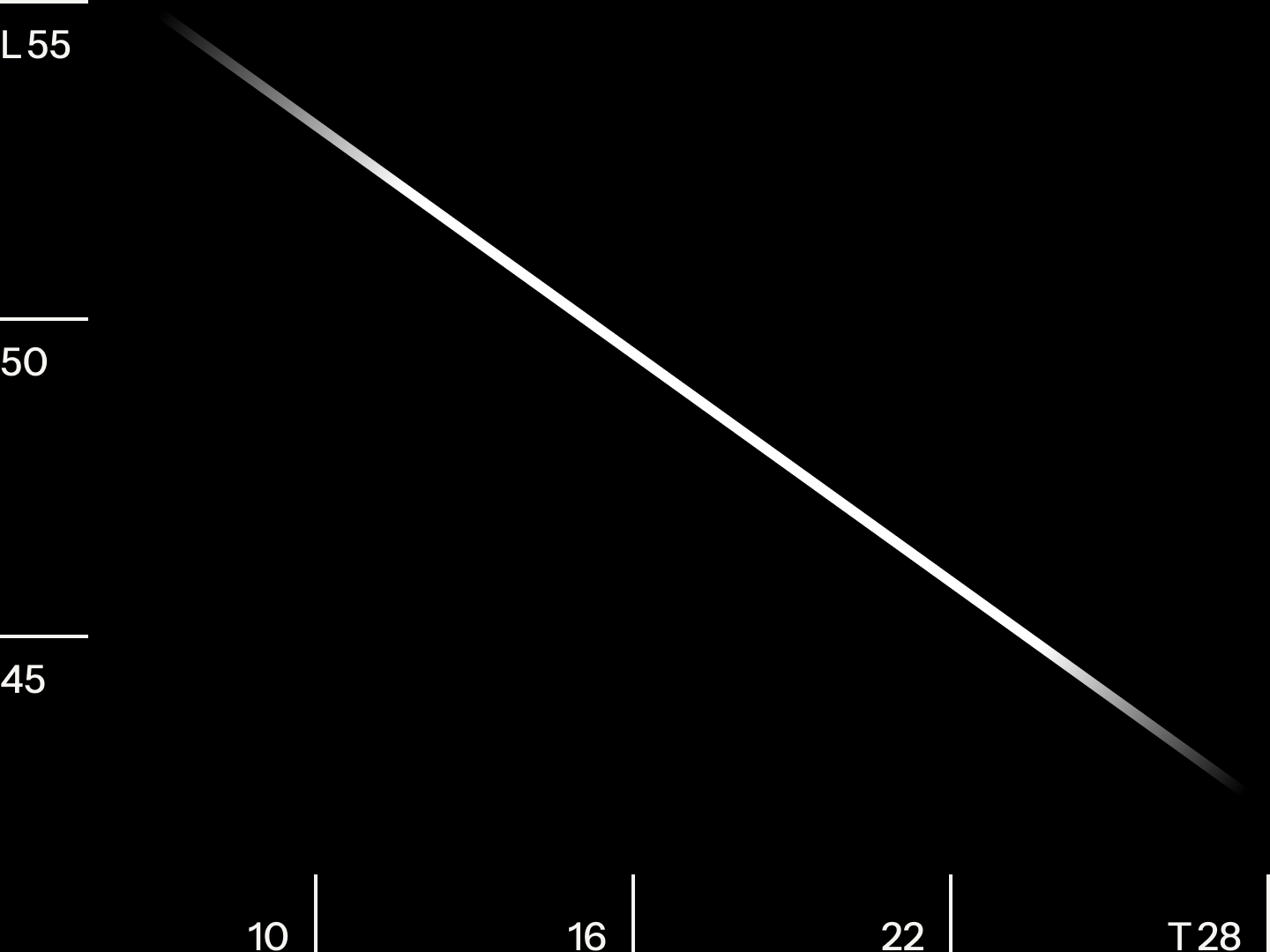
The optical corrections to text color can be described as a linear relationship, with lightness l decreasing at a constant rate as text size t (in pixels) increases.
Text color doesn’t simply invert when a background shifts from light to dark. The eye adjusts its sensitivity based on surrounding brightness, which means changes to lightness are more noticeable on light backgrounds than dark ones. In practice, the opposite of black text on white isn’t white text on black. Instead, text on a dark background should be set in a slightly darkened white. Here, this relationship can be calculated rather than guessed. Color ramps progress sequentially from light to dark, but the lightest tints and darkest shades get more nuance, as was done for the color palette for Morningstar.
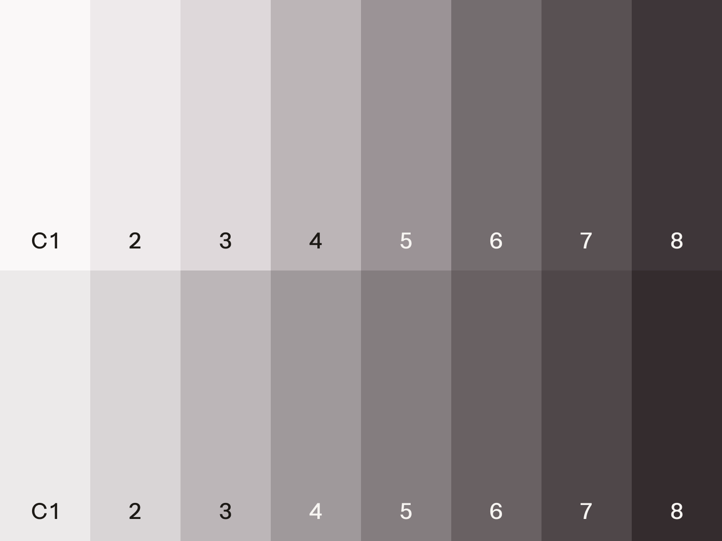
On light backgrounds, foreground colors c is expressed as stops and ease into shades slowly (top); colors on dark backgrounds progress more or less uniformly (bottom).
The optical adjustments to light and dark theme palettes can be described using sigmoid functions; foreground colors c on light backgrounds decrease in lightness l slowly at first (top line), while colors for dark backgrounds decelerate into darkness more uniformly (bottom line).
On product screens, components typically layer on top of each other, resulting in concentric curves at the corners. If corner radii are scaled proportionally, they feel “off” and add noise to the screen. So, as the container size changes, corner radii also require optical adjustments. These, too, can be described as a mathematical function.
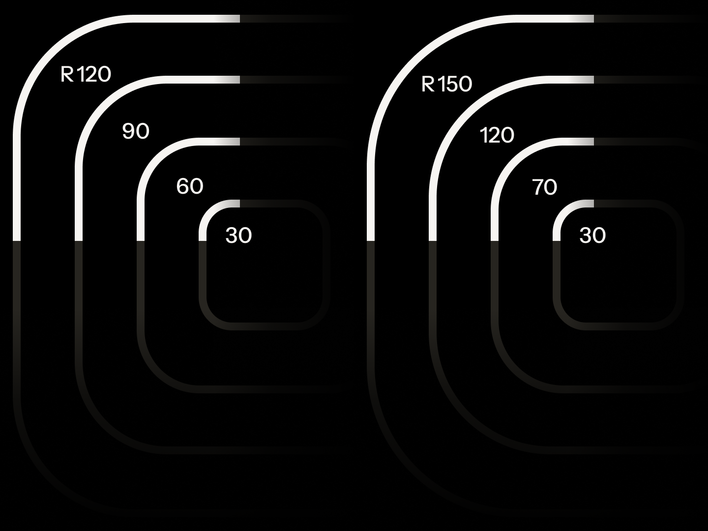
When corner radii r (in pixels) increase at the same rate as the container, bulging occurs at the corners (left); exaggerating these corners at the outer layers corrects this optical illusion (right).
The optical adjustments to corner radii can be modeled as a “hockey stick” function, in which the radius r increases slowly at first and then rises sharply as the container size n (in pixels) grows.
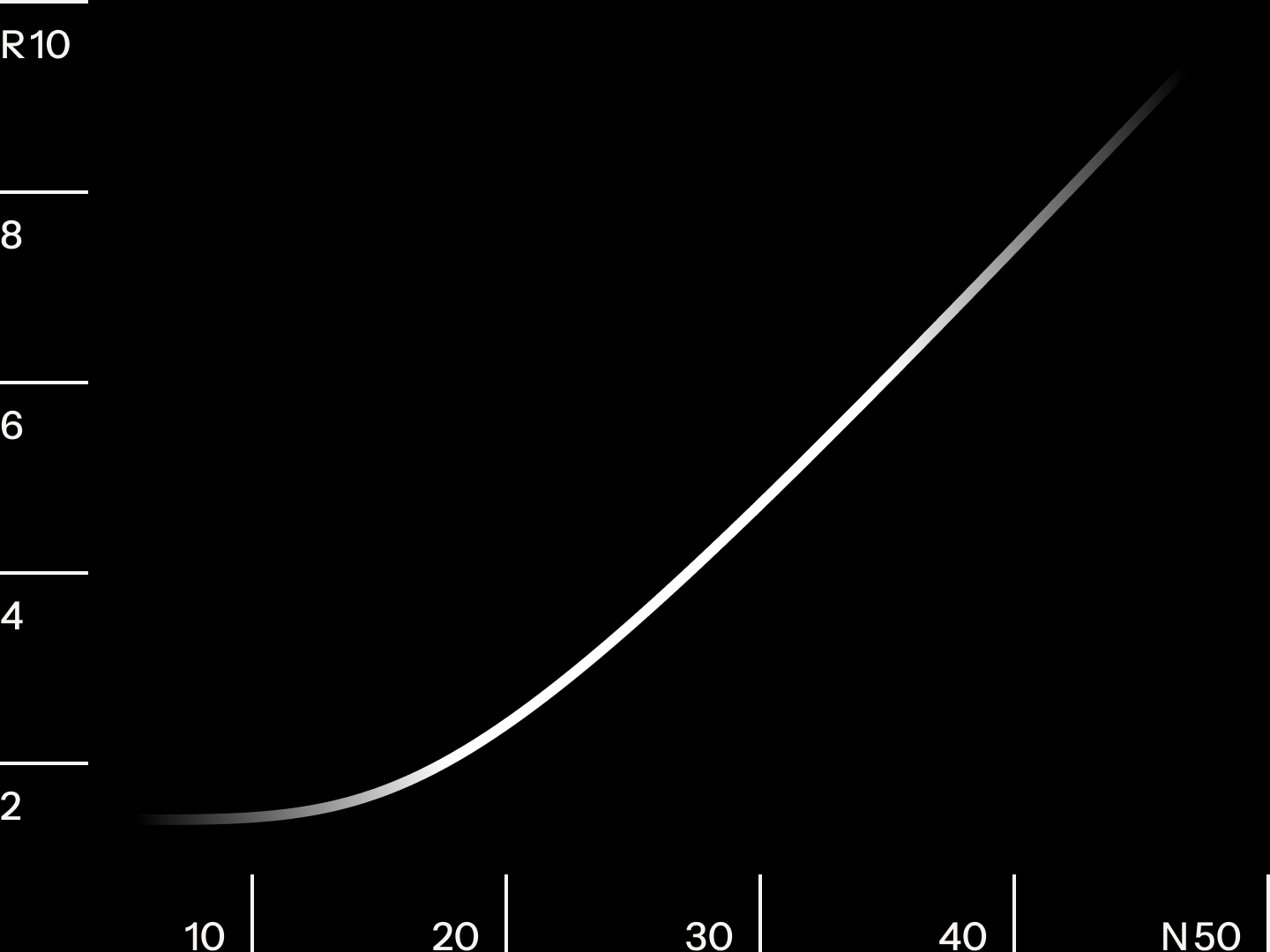
Not all optical corrections to circular forms can be described by the same function. For the Morningstar logomark to maintain its characteristic delicate line quality at all sizes, its line weight needs to adjust as its diameter changes. If the logomark was simply scaled proportionally, it would appear too thin at smaller sizes and too thick at larger ones.
As the Morningstar logomark doubles in size, its stroke weight s (in pixels) appears disproportionately heavier (top); optically adjusting weights across sizes corrects this illusion (bottom).
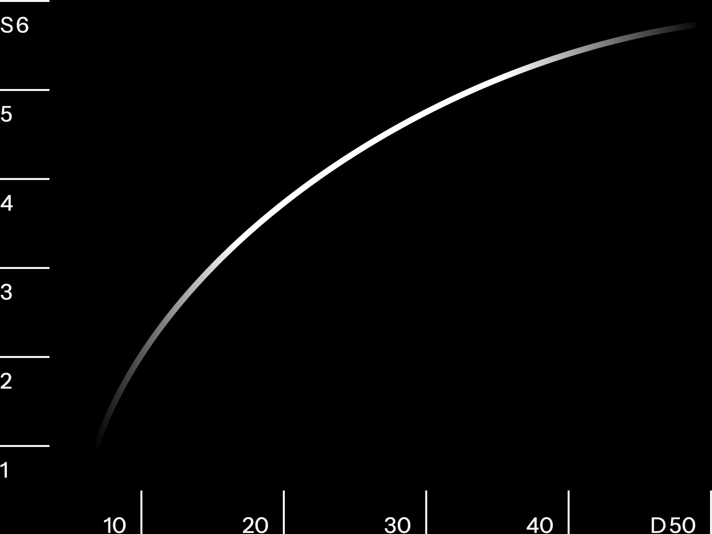
The optical adjustments to stroke weight follow a power-law curve, in which the stroke weight s (in pixels) increases at a slowing rate as the logomark diameter d (in pixels) grows.

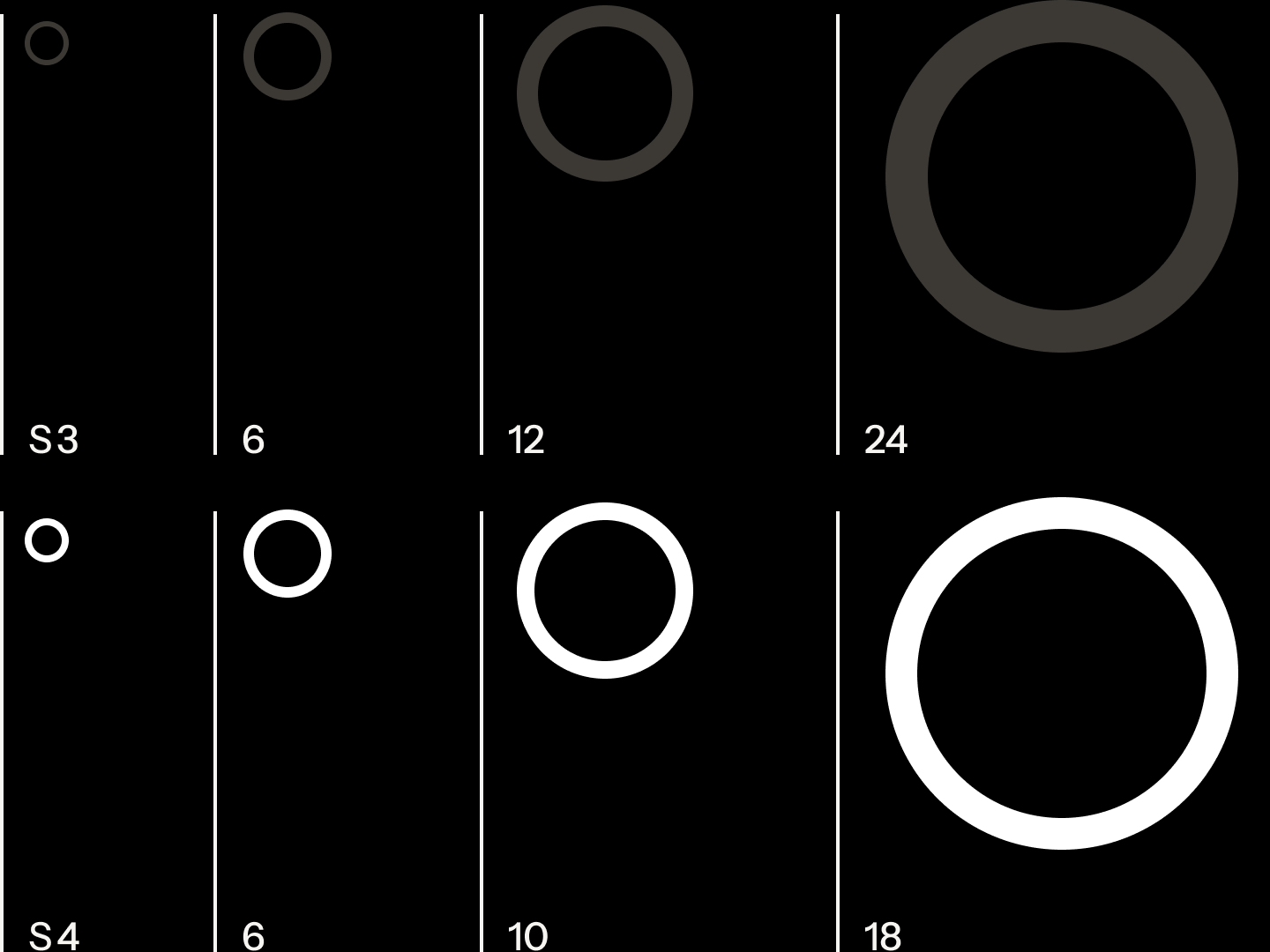
Shown at full size, the Morningstar logomark has a fine line quality.

At smaller sizes, the logomark requires additional line weight to preserve its legibility.
Optical corrections to text, color, and shape can be extrapolated into mathematical functions. They’re particularly powerful when referenced in design systems because they enable systems to require far fewer variable inputs needed to cascade changes throughout products. Traditional design craft can now be scaled to bring more consistent product experiences to the market, faster and easier.
Information graphics set in Instrument Sans and Instrument Serif.
Brand Identity
Color Theory
Design Systems
Applied Mathematics
Typography