Morningstar Color Palette
Building a scalable framework for color

Morningstar has long distinguished itself in the financial services industry with its fiercely independent research. When it was founded in 1984, the company primarily sold print products, like research reports, investor newsletters, and investment books. Today, clients interact with it in many more ways: on paper, on screen, and in person.

In 1991, famed American designer Paul Rand (1914–1996) drew the Morningstar logo and chose PMS 185, an electric, bright red, which stood out against the sea of blues and greens competitors were using at the time.
Eventually, more colors were added. Blues, greens, oranges, and yellows were defined for asset classes and performance-based metrics. Additional blues were introduced into products requiring accessibility compliance. Even more colors were added for use in campaigns and marketing.
The ad hoc growth of the palette resulted in an accumulation of colors that overlapped, left gaps, or contradicted each other.

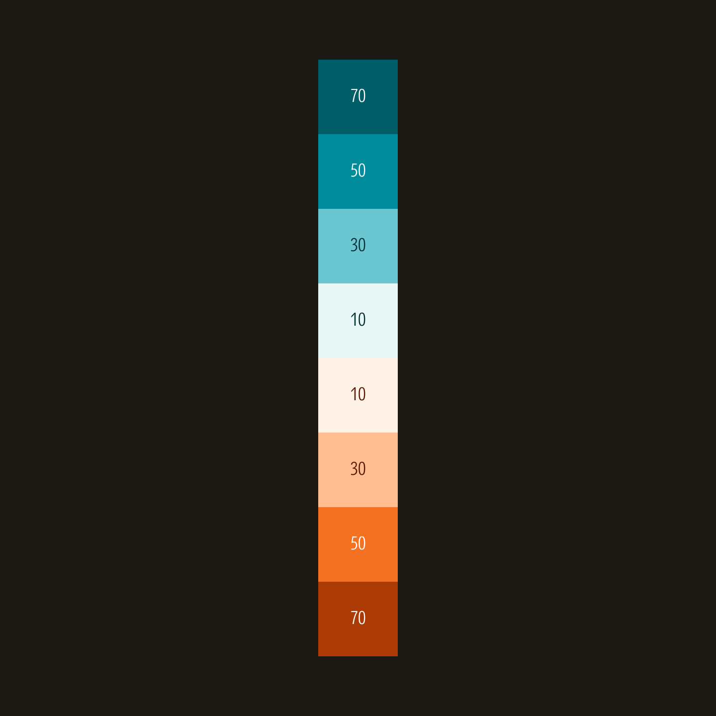
Similar colors from different color classes

Shades of a similar color from different color classes

Colors in the same class with different saturation

Shades of the same color with large jumps in steps
Colors were grouped, re-classed, or removed to reveal a more focused set. Each color's hue was also pulled closer towards Morningstar Red for a more unified palette. At the same time, their chroma was softened so they could support, and never compete with, Morningstar Red.


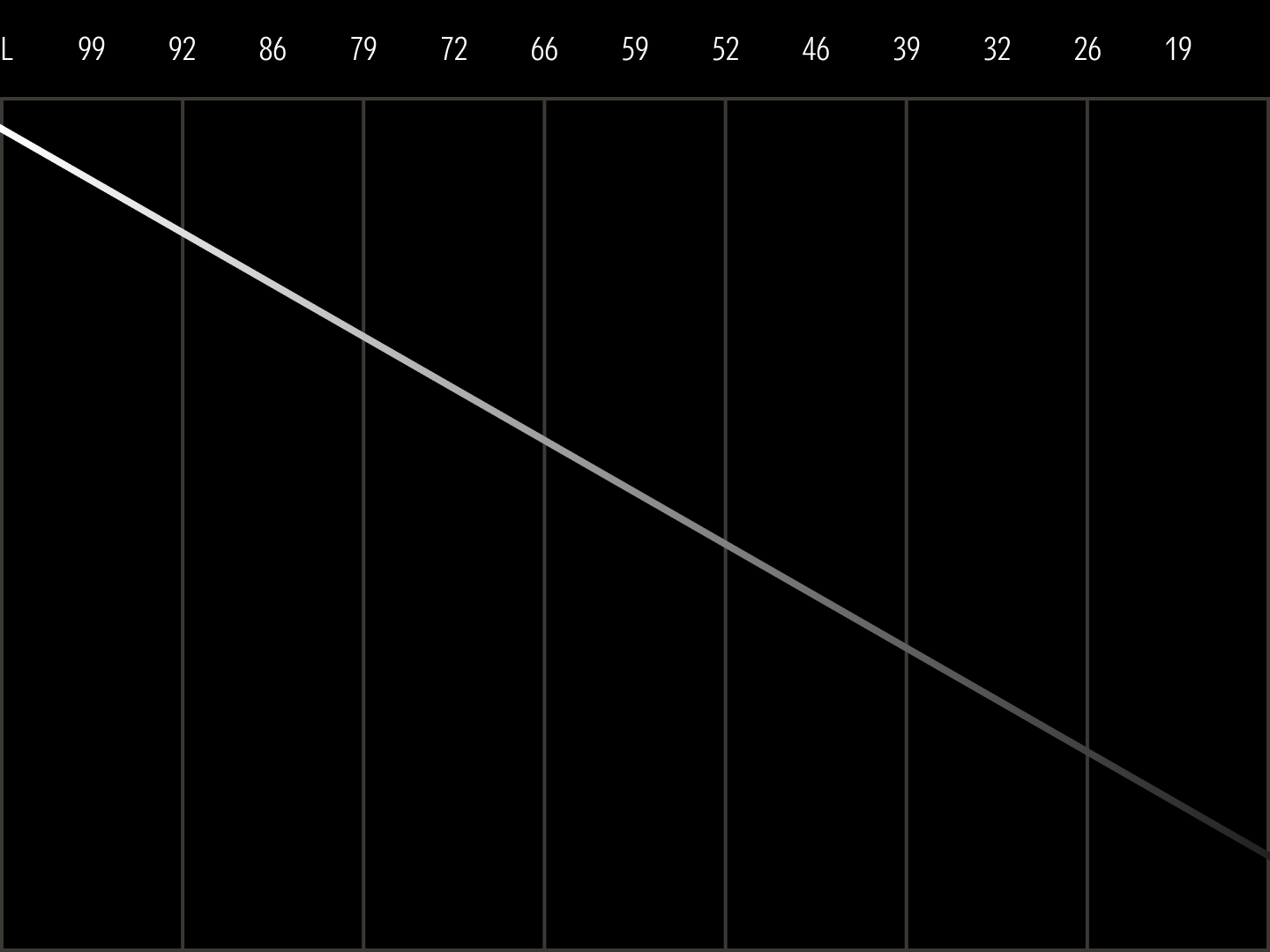
Working in the OKLch color model, colors were expanded and organized sequentially into ramps with predictable steps from light to dark. Since this color model is perceptually uniform, it better represents how the eye actually sees color relationships. This means that contrast ratios are more consistent at each step, making it simpler to achieve the minimum contrast, as required by Web Content Accessibility Guidelines (WCAG).


Yet building a color ramp that feels visually consistent from light to dark requires more than technical accuracy. Blue, for example, has a hue value of 270°. If only lightness is changed, the tints and shades appear to take on a red tinge. By adjusting the hue on the extreme ends of the ramp, blue now appears to retain its hue from the lightest to the darkest of values.

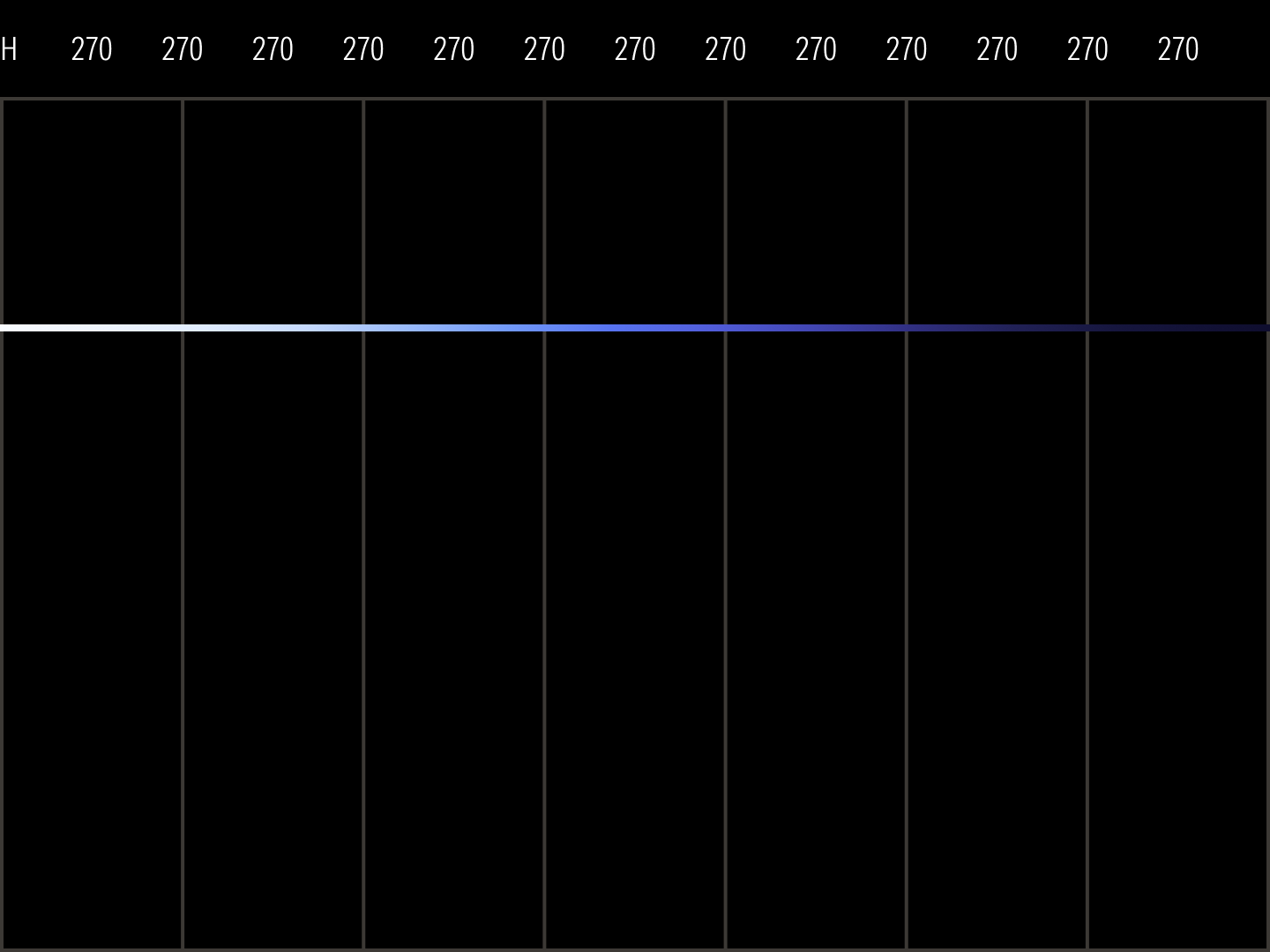
Flat Hue
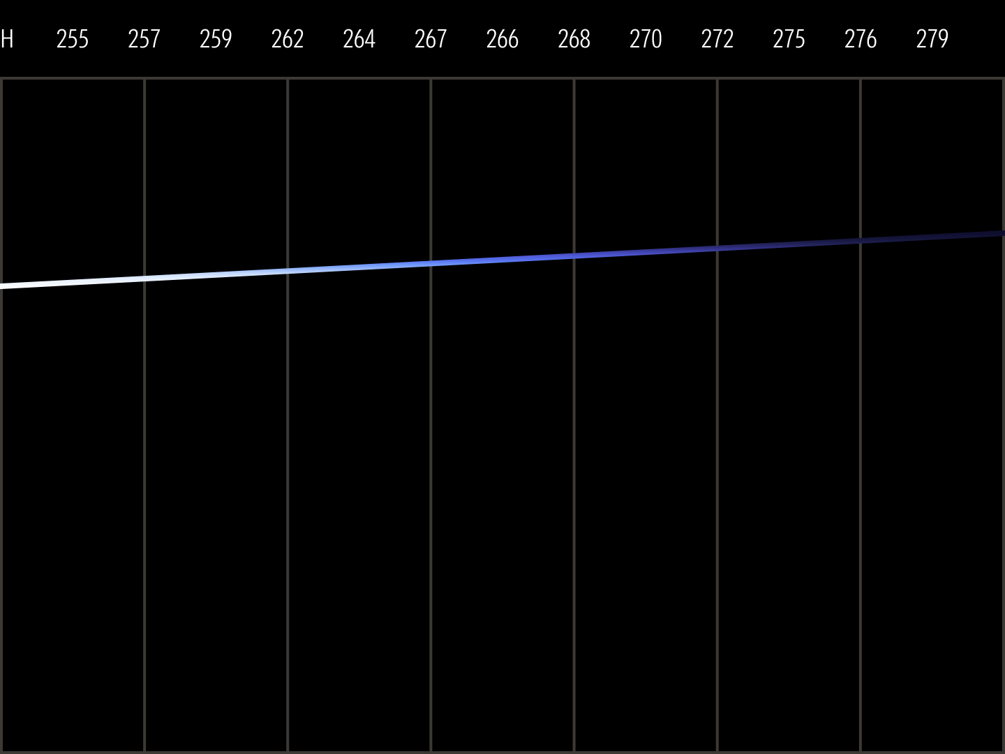
Sloped Hue
In principle, color ramps should follow a linear progression from light to dark; this palette plots colors along an s-curve. This means colors get darker slowly at first, advances uniformly through the middle range, then tapers back slowly into black. This eased progression gives the ramps greater versatility because it offers more nuanced tints and shades at the extremes to accommodate both light and dark theming.
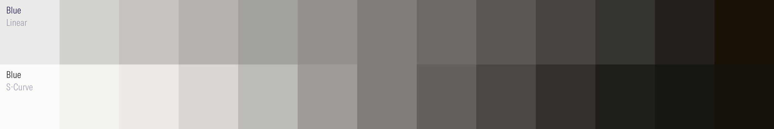
Linear Lightness
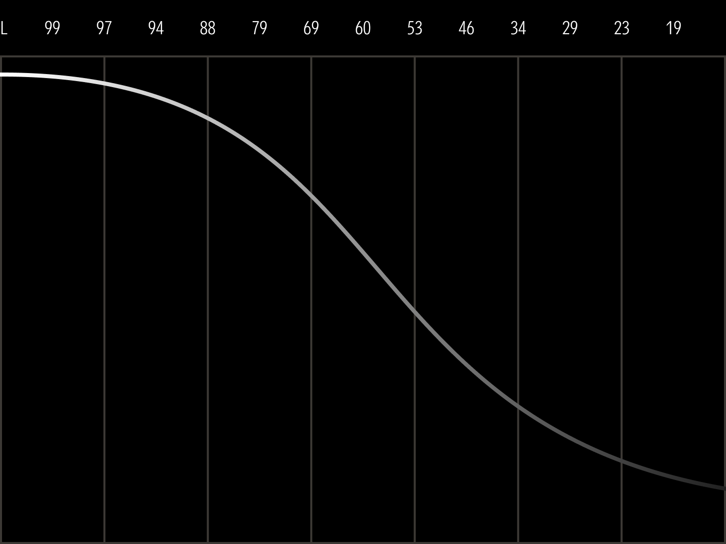
S-Curve Lightness
Individual color ramps can then be organized into grouped color families. Focused designs and simple data visualization benefit from 1- or 2-color families. Complex charts, layered compositional hierarchies, or intricate illustrations may need 3- or more color families.


With the new color palette, product teams can reassign color roles in components. Elsewhere, colors can be mapped to data visualization schemes like sequential, divergent, and categorical palettes. Marketing sub-palettes can now be defined for more segmented storytelling. The palette’s predictable structure now allows teams to make design decisions more quickly while ensuring every choice feels uniquely Morningstar.


Color has the power to reveal hidden data patterns, guide users through complex interfaces, and inspire action through evocative campaigns, ultimately helping investors make important decisions with confidence. Built with flexibility at its core, this color framework enables Morningstar to adapt to an ever-changing investment landscape while staying true to its mission of empowering investor success.
Brand Identity
Color Theory
Design System