Morningstar Design System 2.0
Building a framework for the digital experiences of tomorrow
For over 40 years, investors worldwide have depended on Morningstar for its trusted research and data. While the core of what Morningstar delivers hasn’t changed, the way it’s delivered has.
Morningstar Design System was originally released in 2017 with a basic library of components and guidelines that teams used to build products more quickly. However, as the number of products multiplied, technical and design debt grew. Greater expectation for consistency across complex customer journeys, along with increasing regulations around accessibility, led teams to override styles and fork components.
Components like buttons were often forked.
Colors were added ad hoc and lacked logic.

Line quality differed among components and icons.
Icons represented outdated or uncommon metaphors.
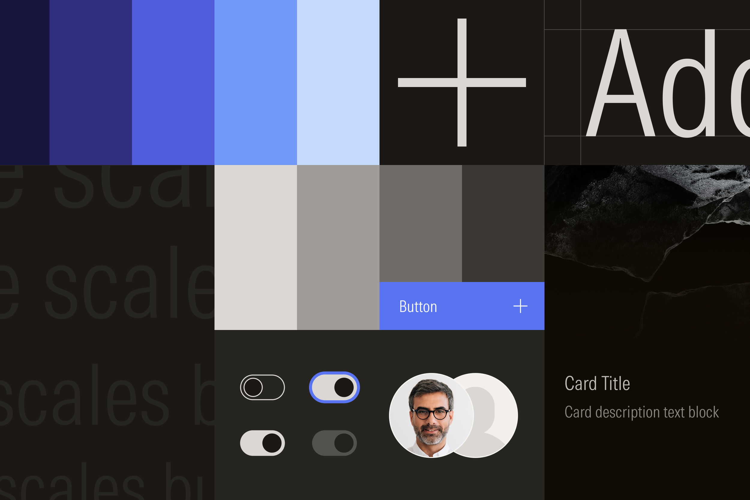
Design systems begin with strong points of view on foundational elements like color, typography, and layout. While these styles should be rooted in good design craft, they must also be governed by an underlying mathematical logic of ratios, sequences, and other measurable relationships to handle the demands of a modern design system.
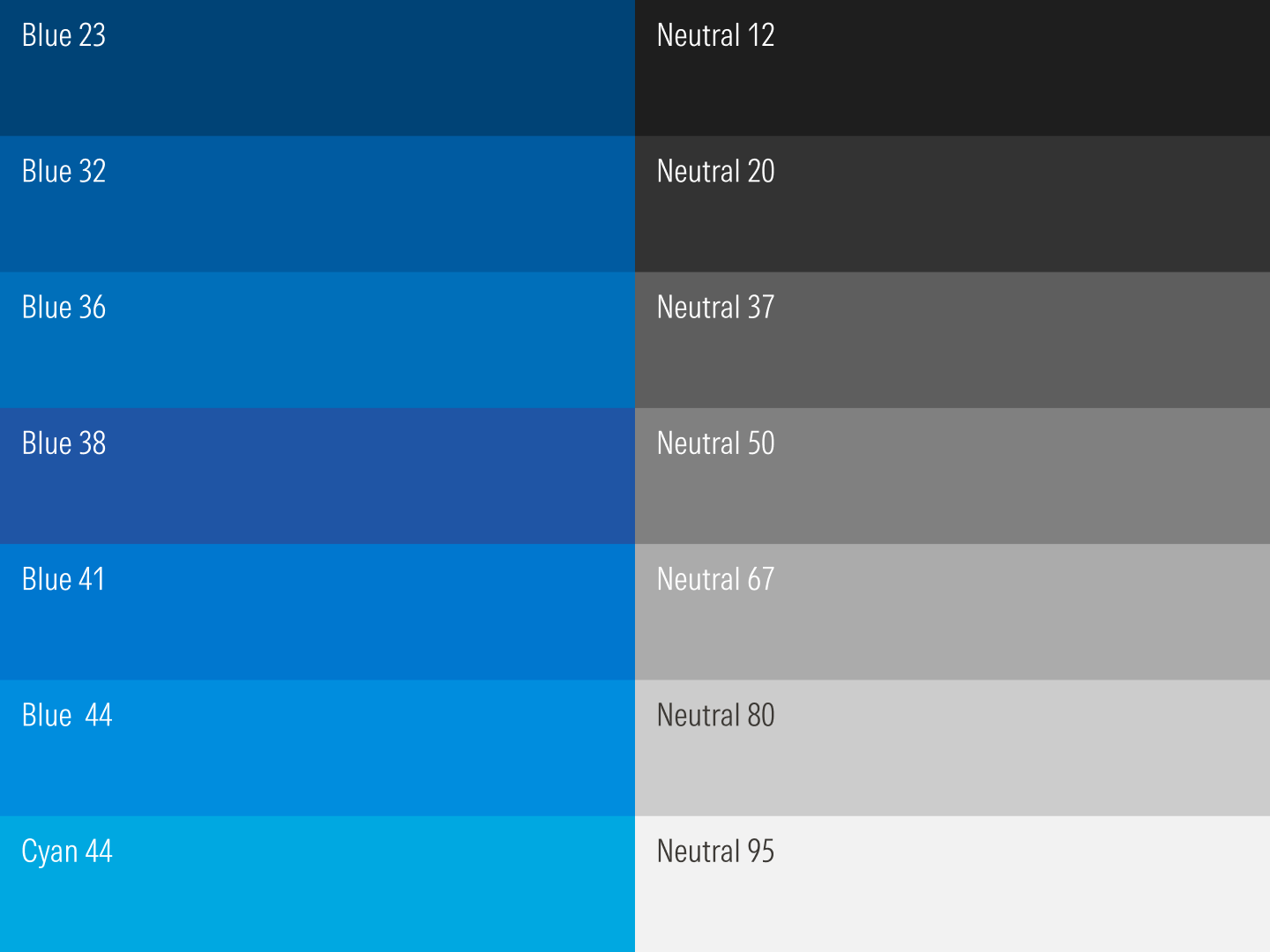
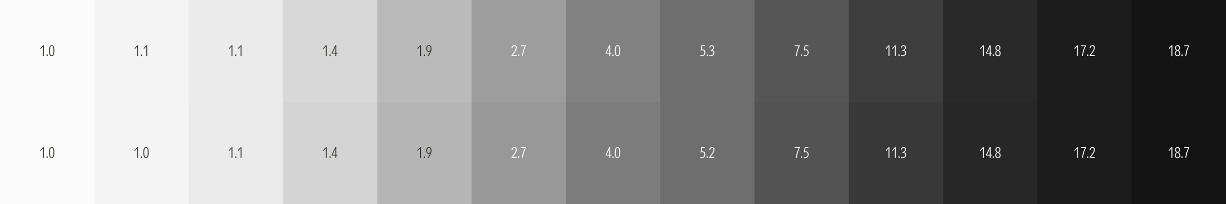
Drawn from the Morningstar color palette, the colors used in the design system are mathematically defined and organized sequentially into ramps with predictable steps from light to dark. Special attention was taken to ensure similar contrast ratios across colors to simplify theme creation and achieve minimum contrast ratios as required by Web Content Accessibility Guidelines (WCAG).
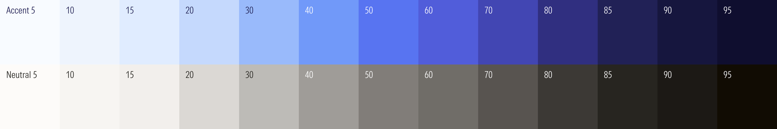
Colors progress along the ramp in a predictable manner.
Colors at any stop share similar contrast ratios.
Colors meet the 4.5:1 contrast threshold value required for text.
Colors meet the 3:1 contrast threshold value required for graphic elements.
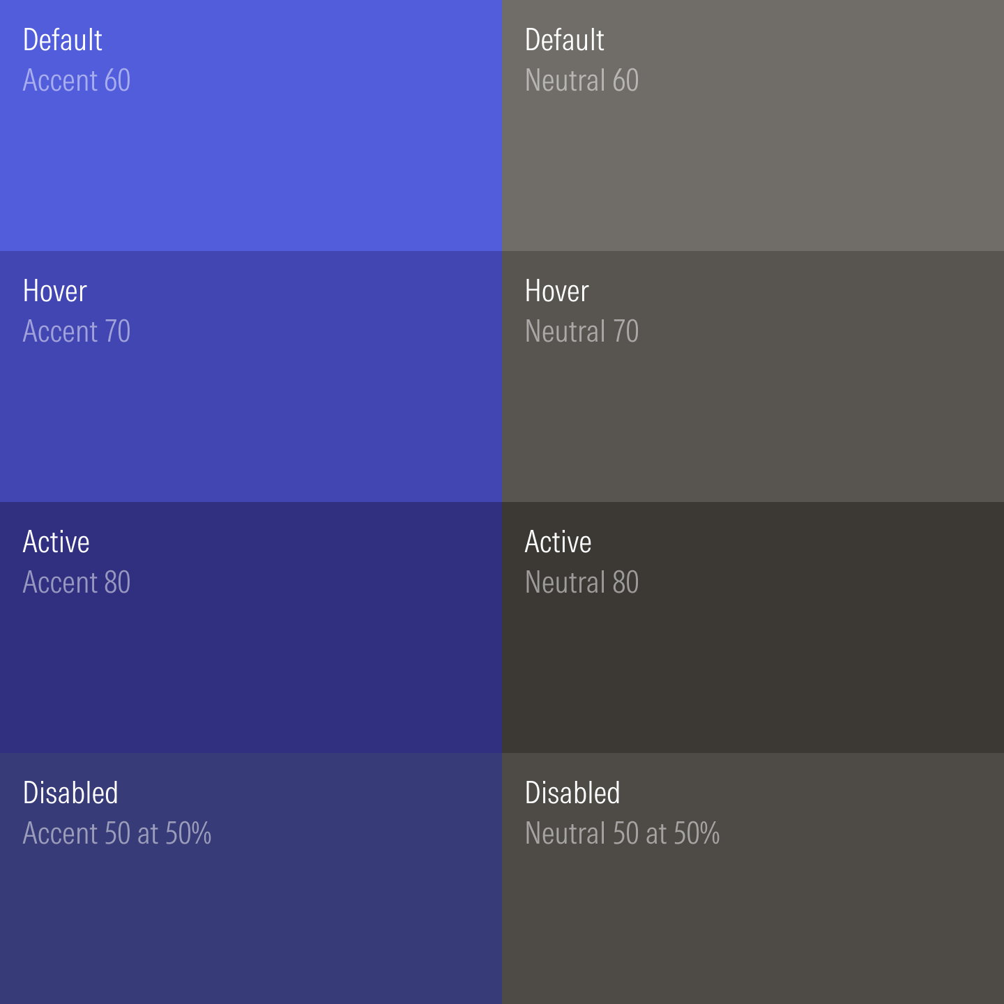
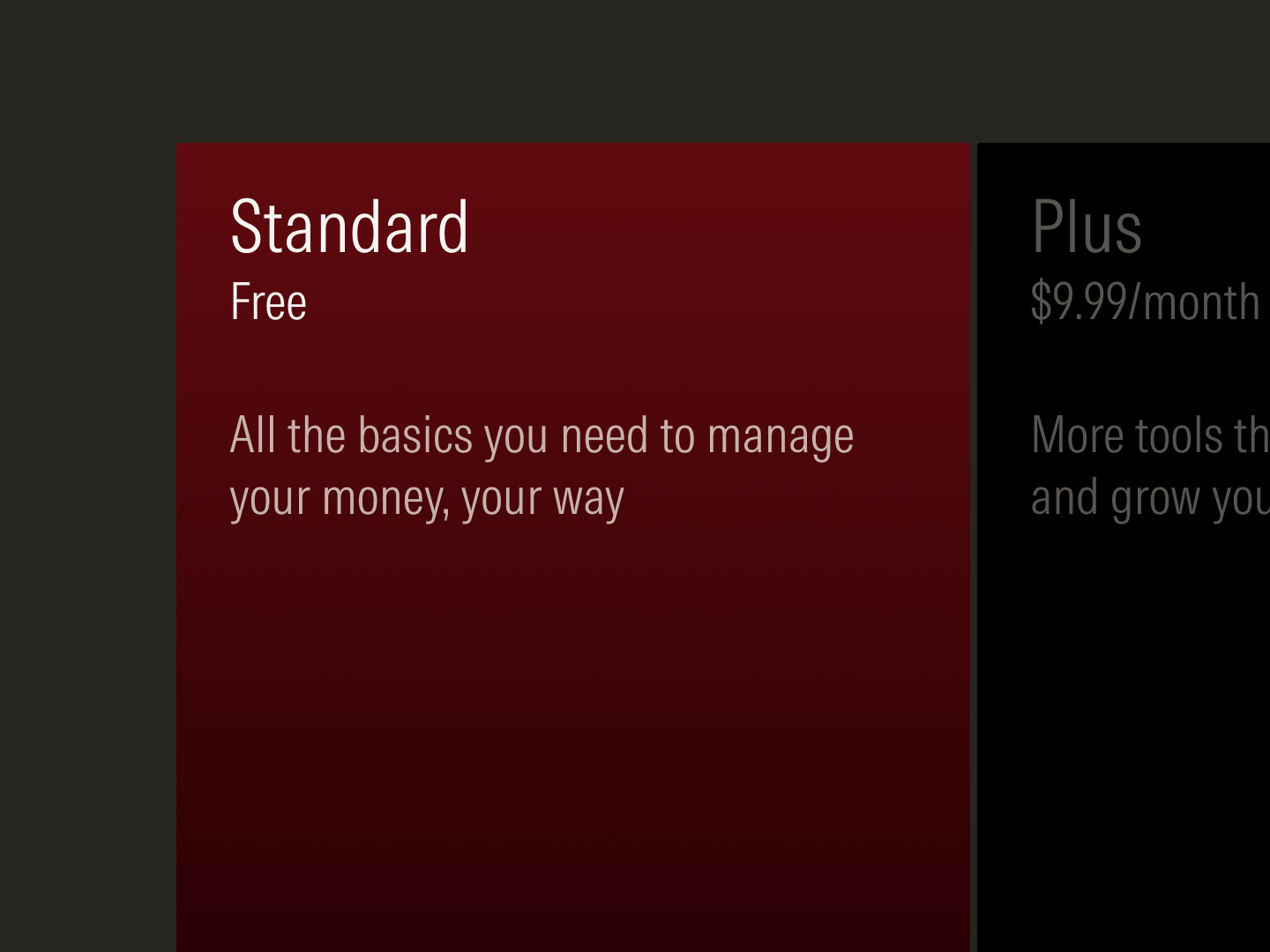
Colors across states take sequential steps along the ramp.
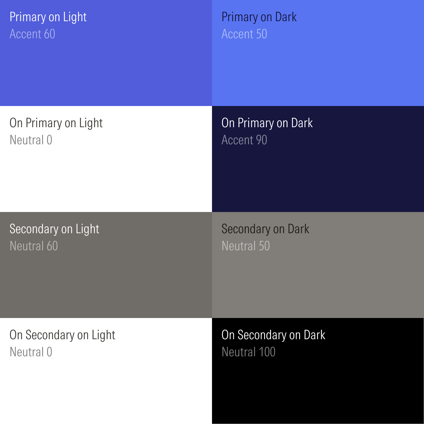
Colors are defined for light and dark themes.
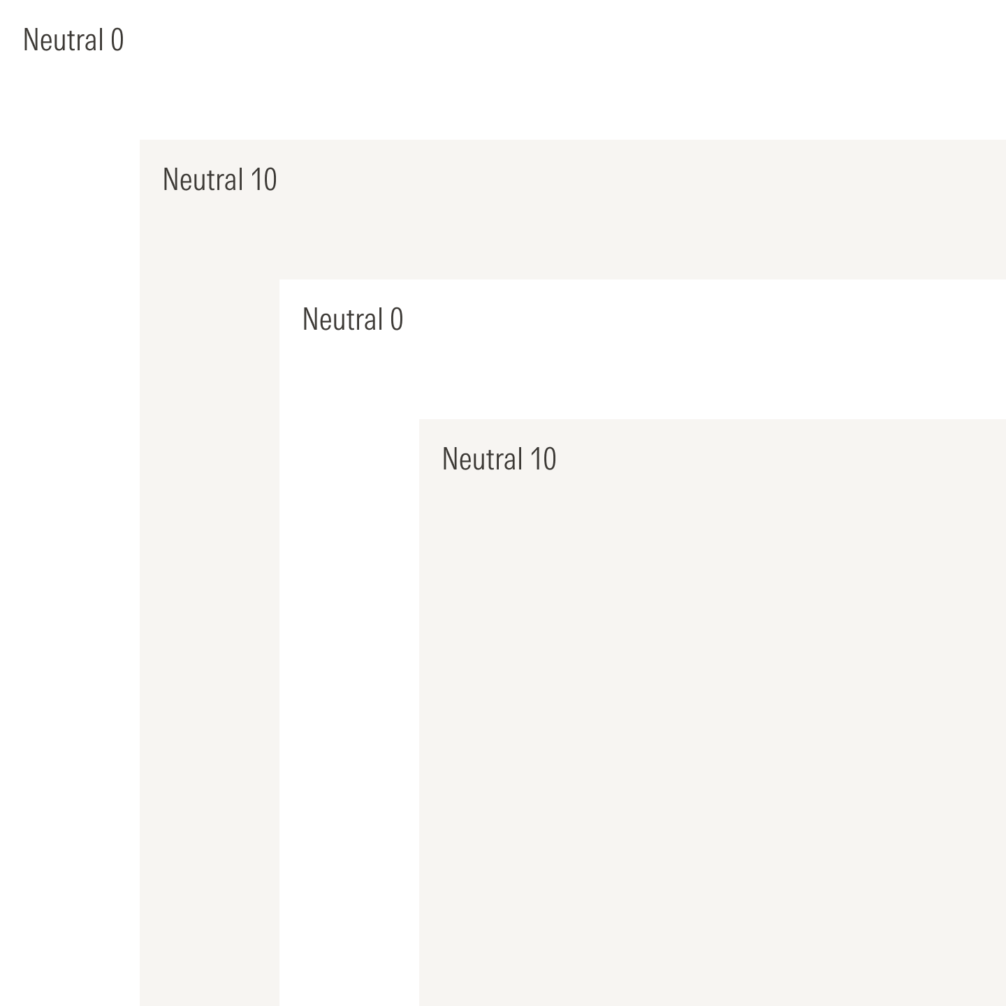
Light neutrals alternate in the light layering model.
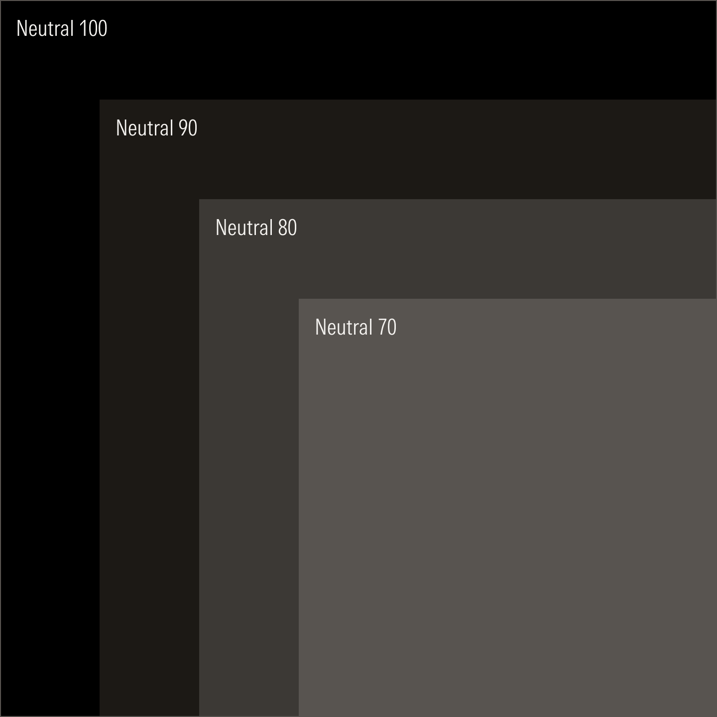
Dark neutrals advance sequentially in the dark layering model.
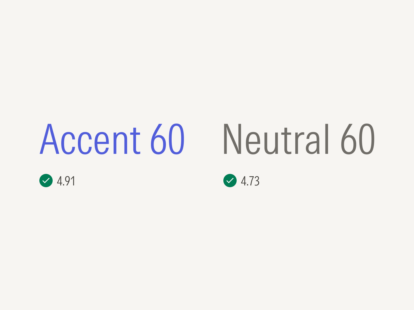
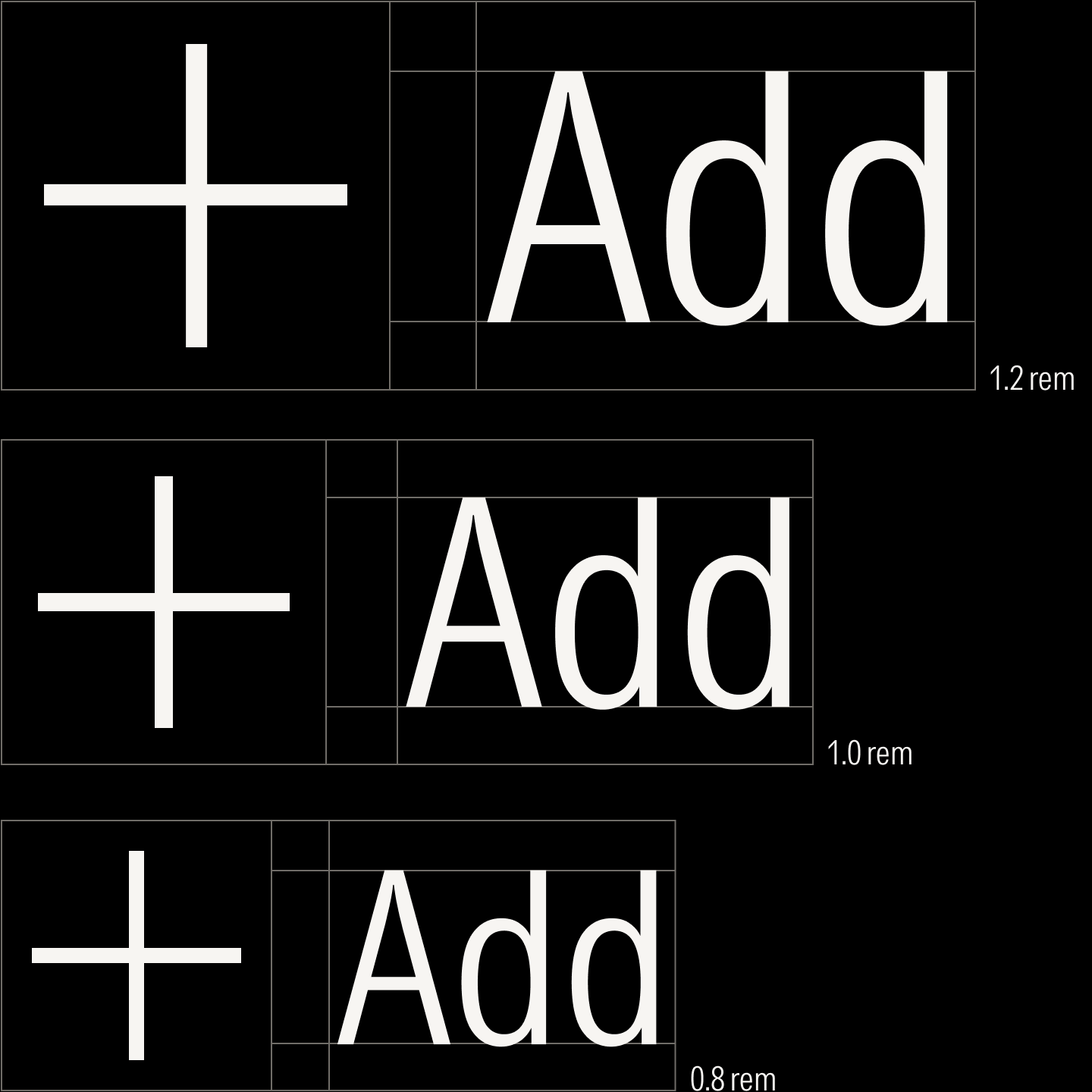
Like colors, the typography in the design system is mathematically defined where ratios determine the sizes of headings, body text, and micro text. Starting from a base unit of 16 pixels, text sizes moves up and down the type scale at a defined ratio. And because the typeface, Morningstar Intrinsic, was custom drawn to perform well on text- and data-heavy layouts, it remains remarkably readable even at the smallest sizes.
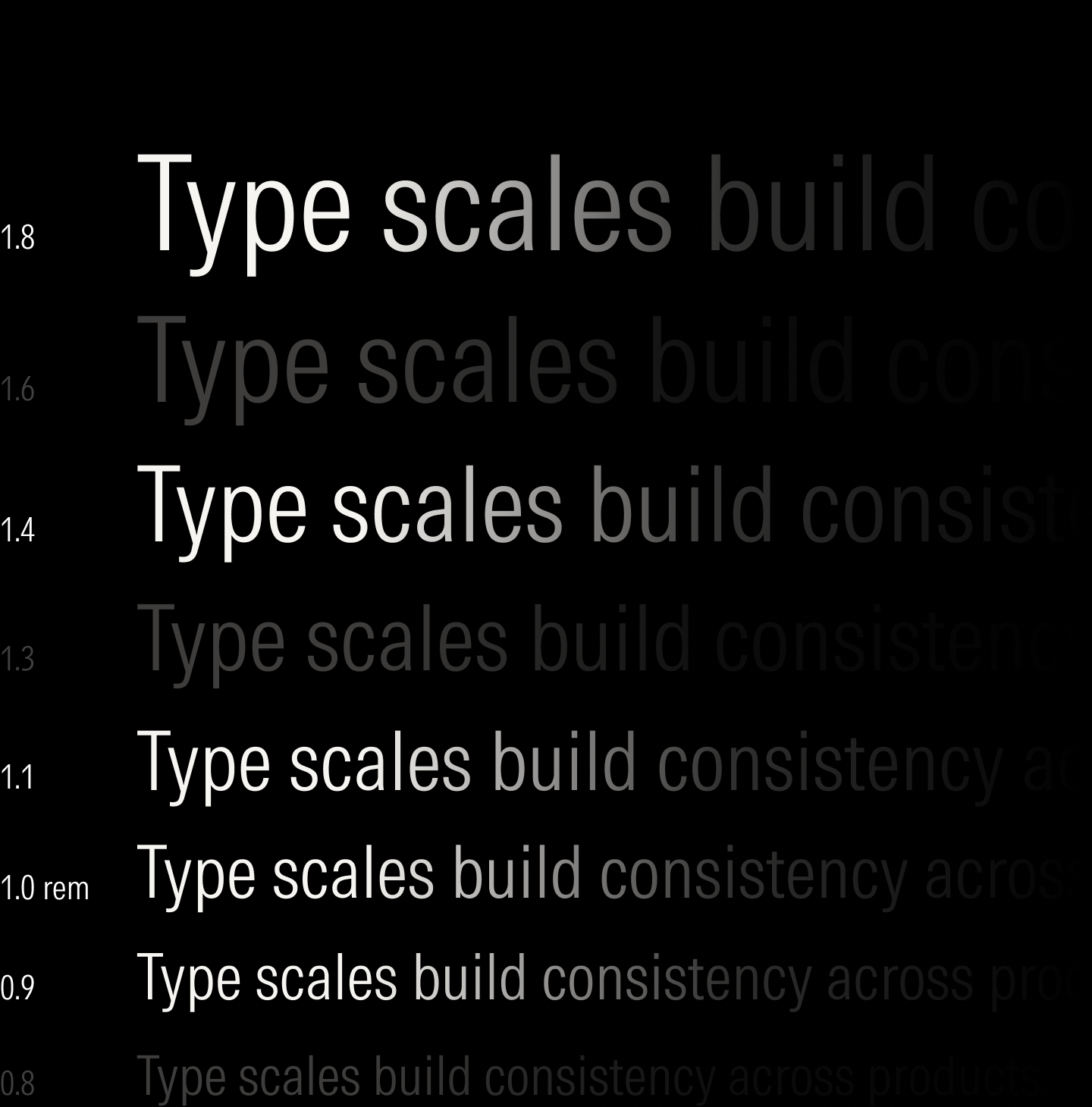
The 1.125 (major second) ratio strikes an acceptable balance between readability in smaller viewports without sacrificing hierarchy.
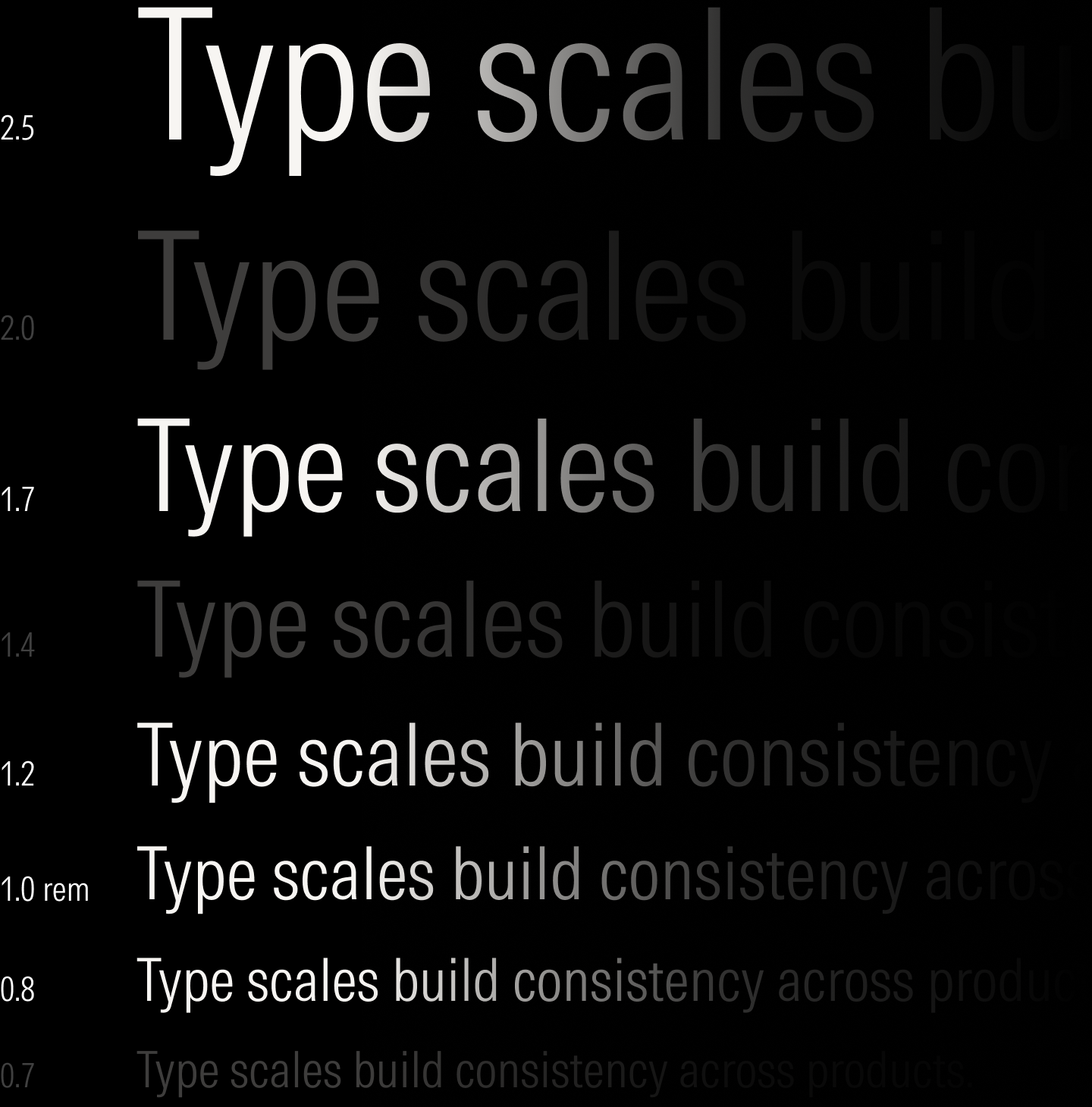
The 1.200 (minor third) ratio establishes clear hierarchy and gives copy room to breathe in larger viewports.
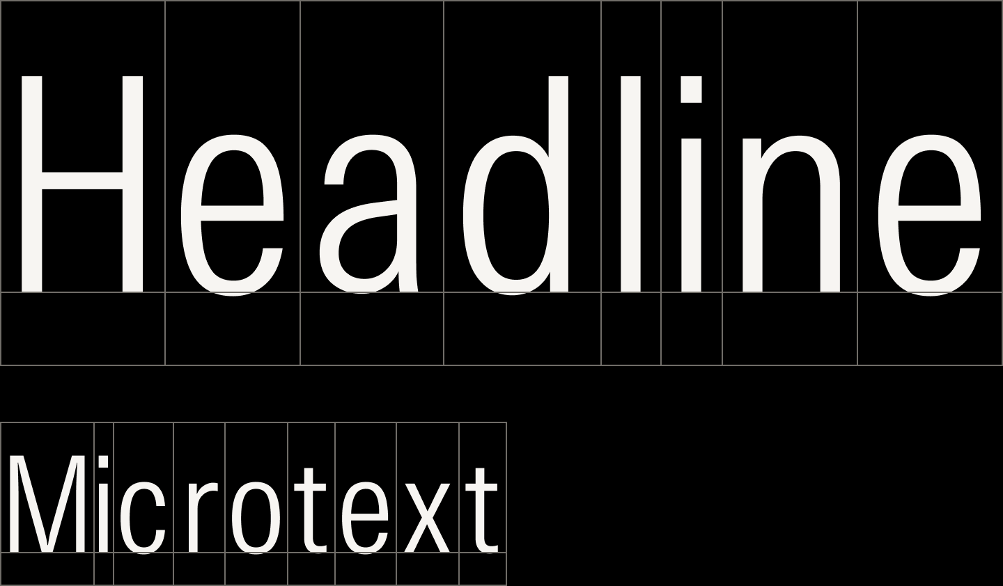
If simply resized proportionally, text has letter spacing that appears loose at larger sizes and tight at smaller ones.
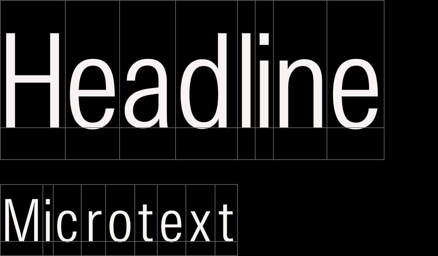
Letter spacing is adjusted along a sliding scale to reduce optical looseness at larger text sizes and improve readability at smaller ones.

Components use the minor third ratio in larger viewports.

For smaller viewports, components use the major second ratio.
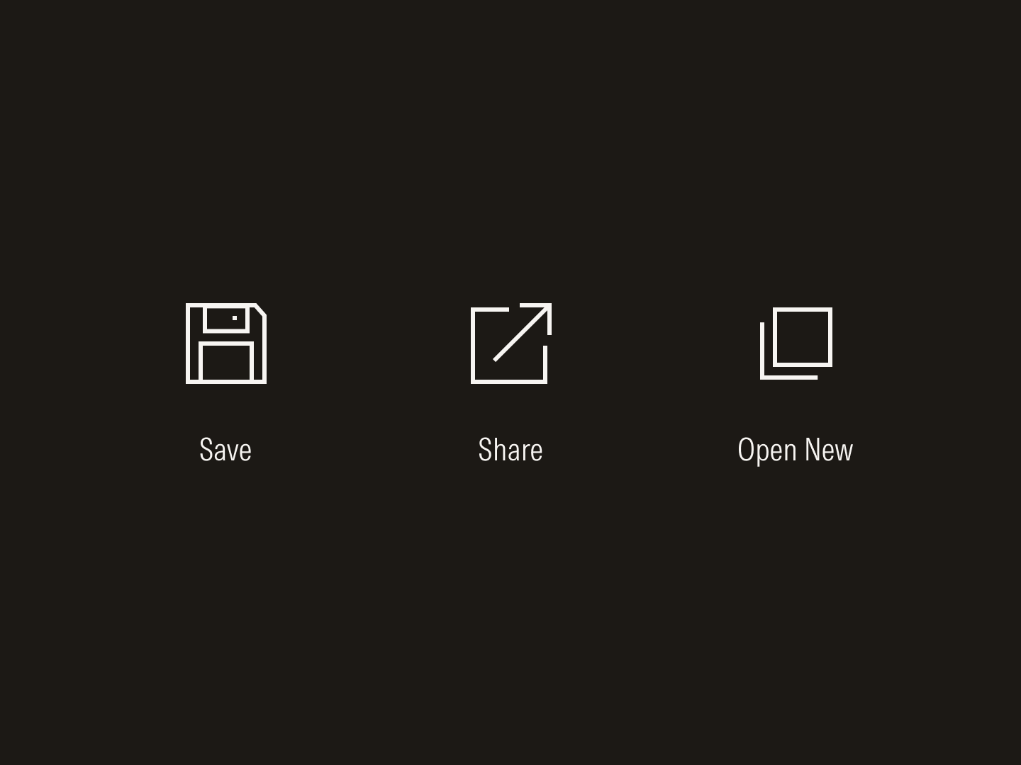
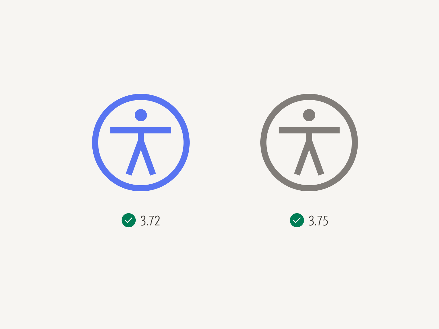
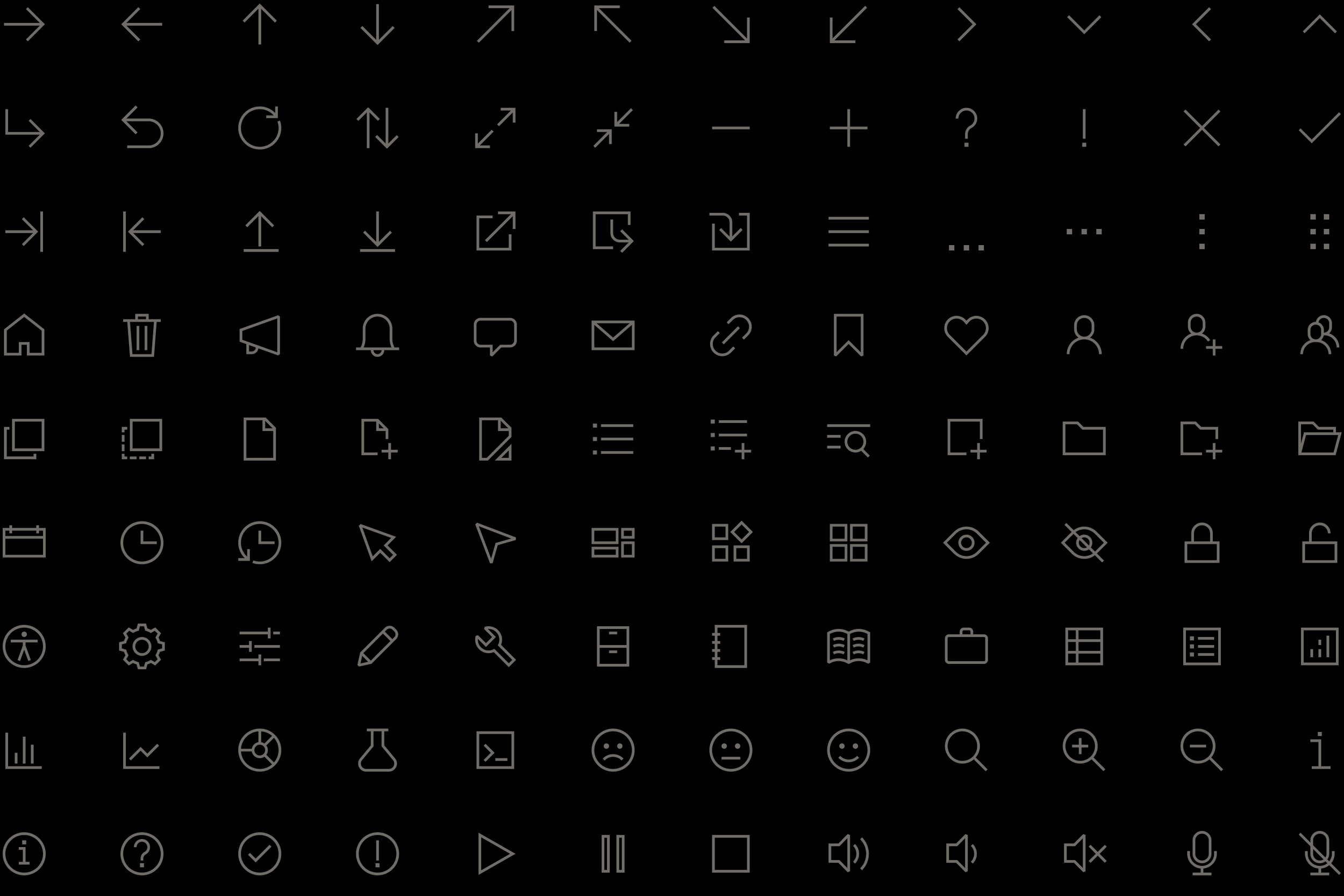
Icons share similar formal qualities with the typeface and scale proportionally to the type scale. They are organized into a library where each icon is tagged with common metaphors to encourage consistent use.
Icons are drawn with a 1 px stroke on an 18 × 18 px grid.
Icons are paired with the base unit and resized proportionally to the type scale.
The icons’ ovoid shapes and corners recall the circular forms and joins of the letters 0 and Z from the typeface, Morningstar Intrinsic.
Similarly, the icons’ dots and end caps mirror the terminals and tittles of !, ?, and E.
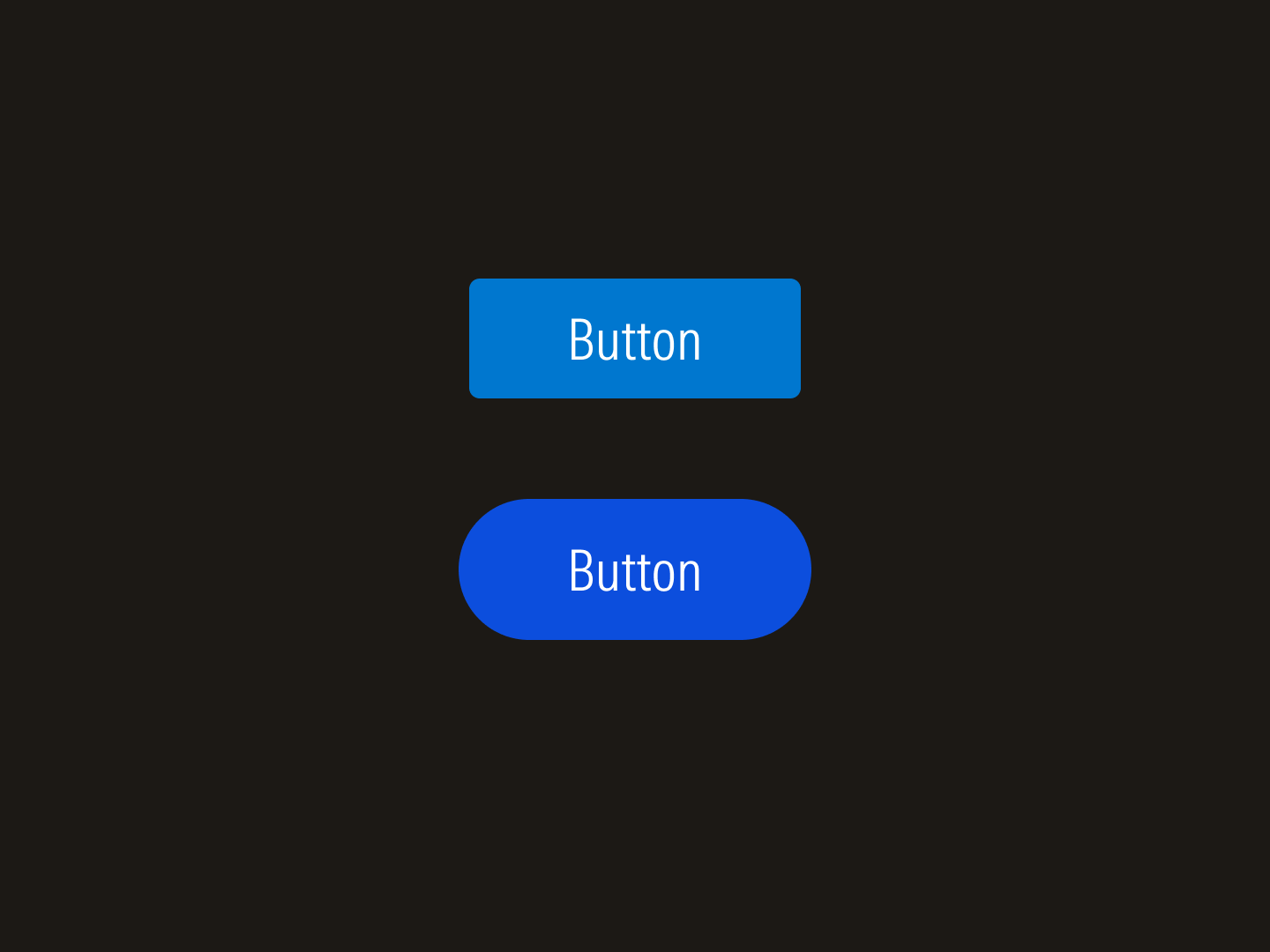
The foundational elements come together to form the components of the system. Designed with modularity in mind and organized into semantic and contextual layers, the components balance both maintainability and flexibility. Variants of the same component share the identical structure and behavior but allow the design system to adapt to all digital experiences, from product interfaces to marketing landing pages.
Button variants
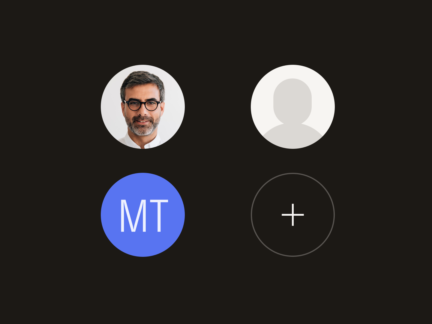
Avatar variants
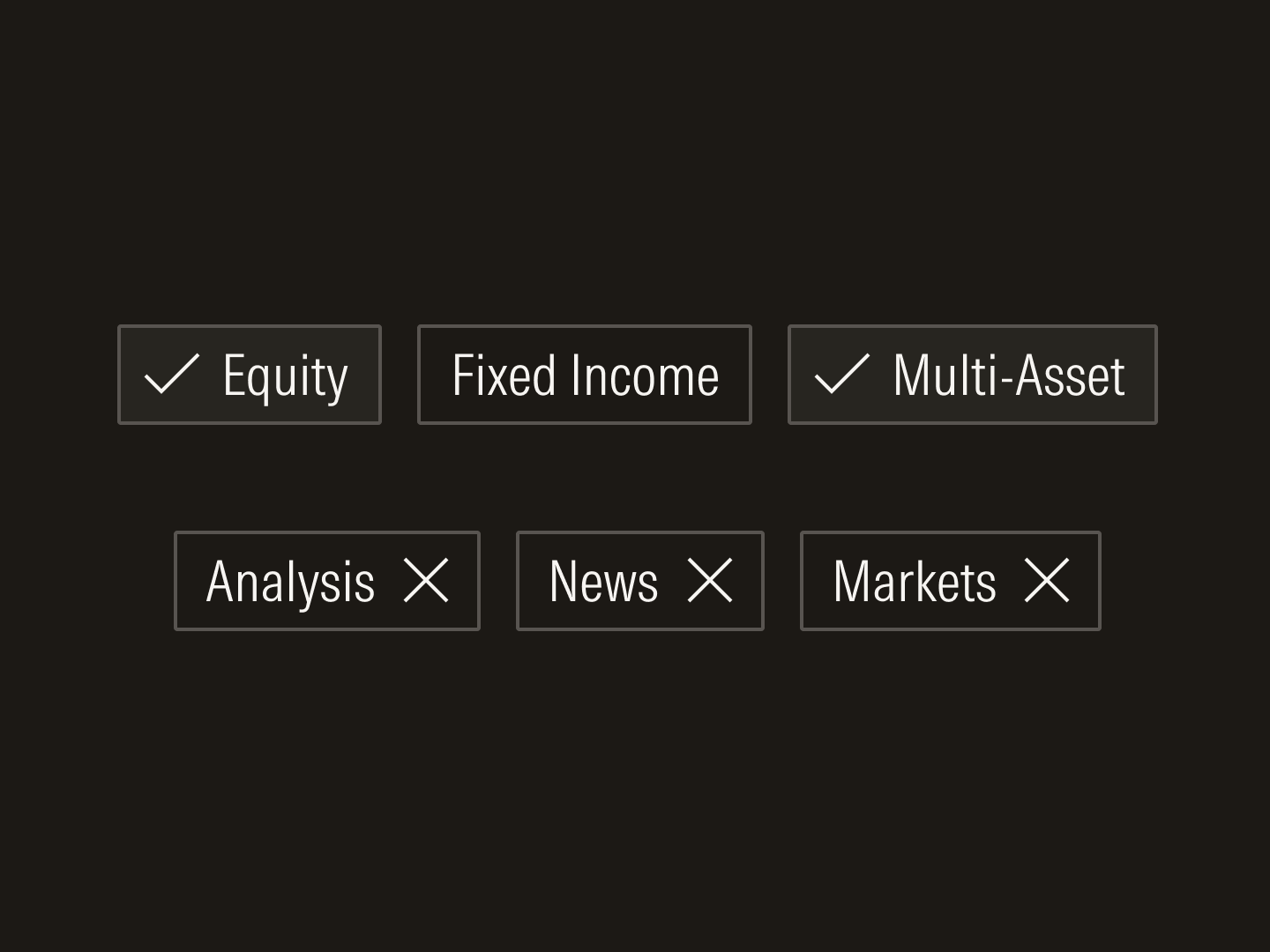
Chips and tags
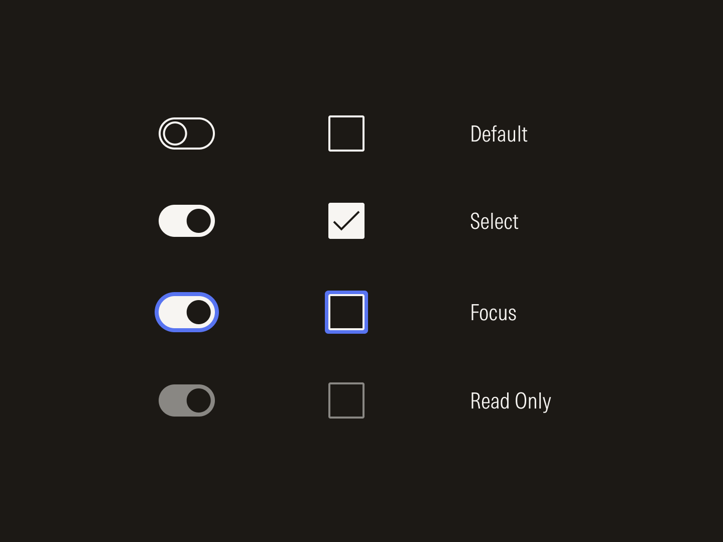
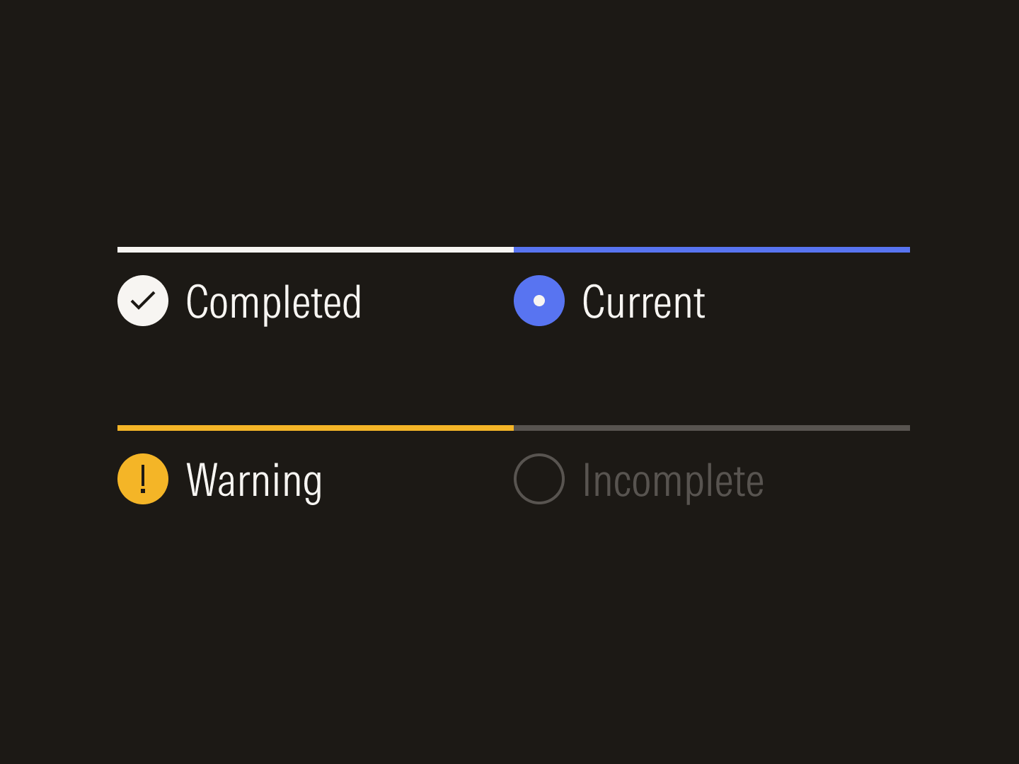
Radio buttons and check boxes
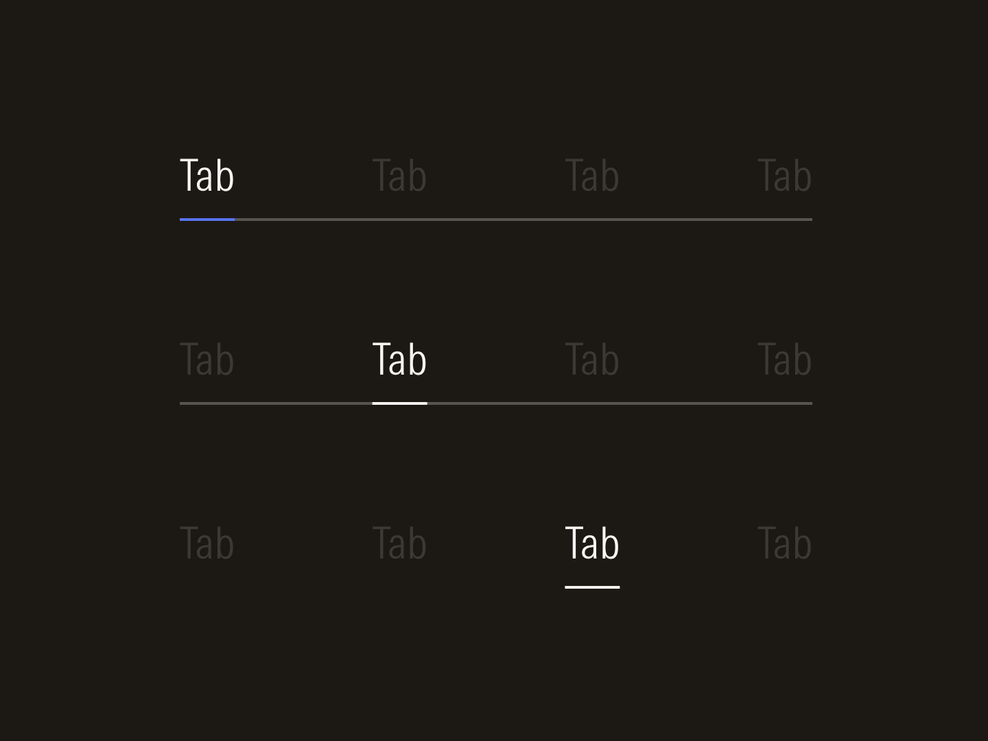
Navigation variants
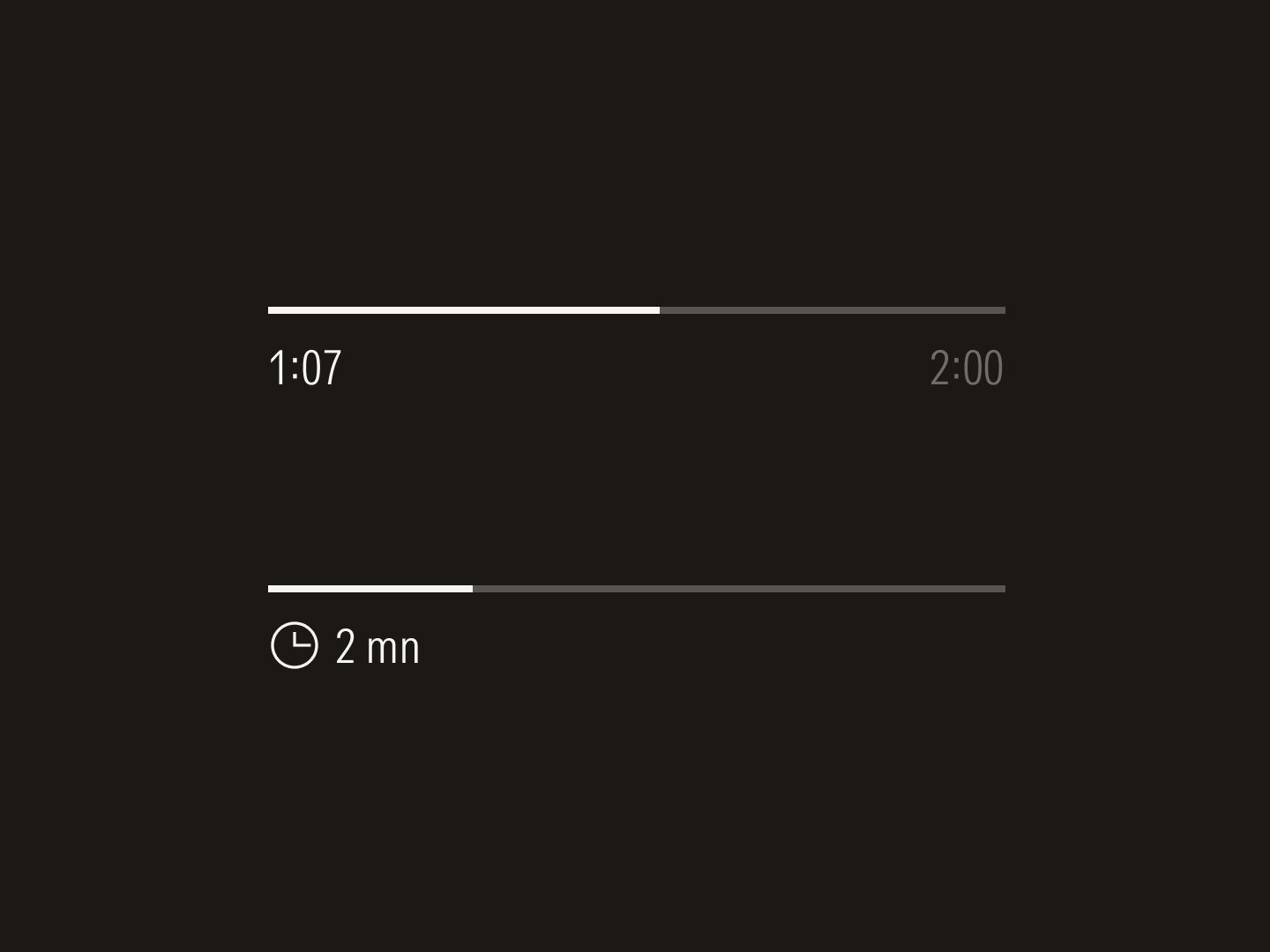
Progress bars
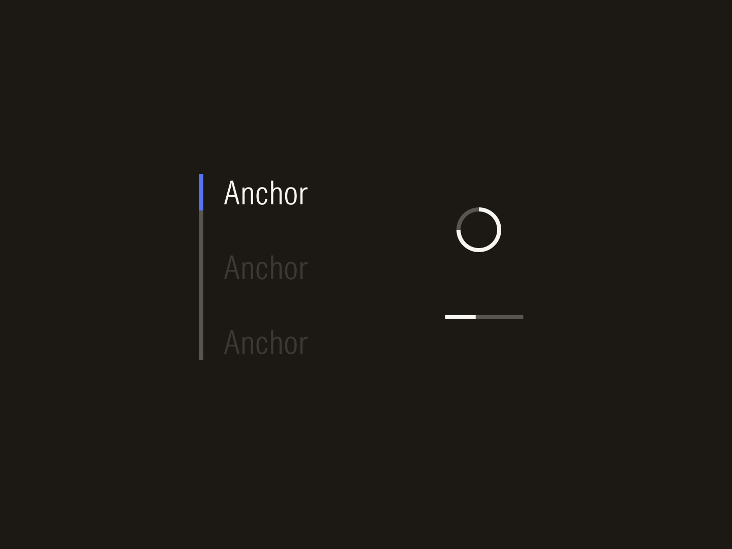
Sidebar navigation and loaders
Stepper states
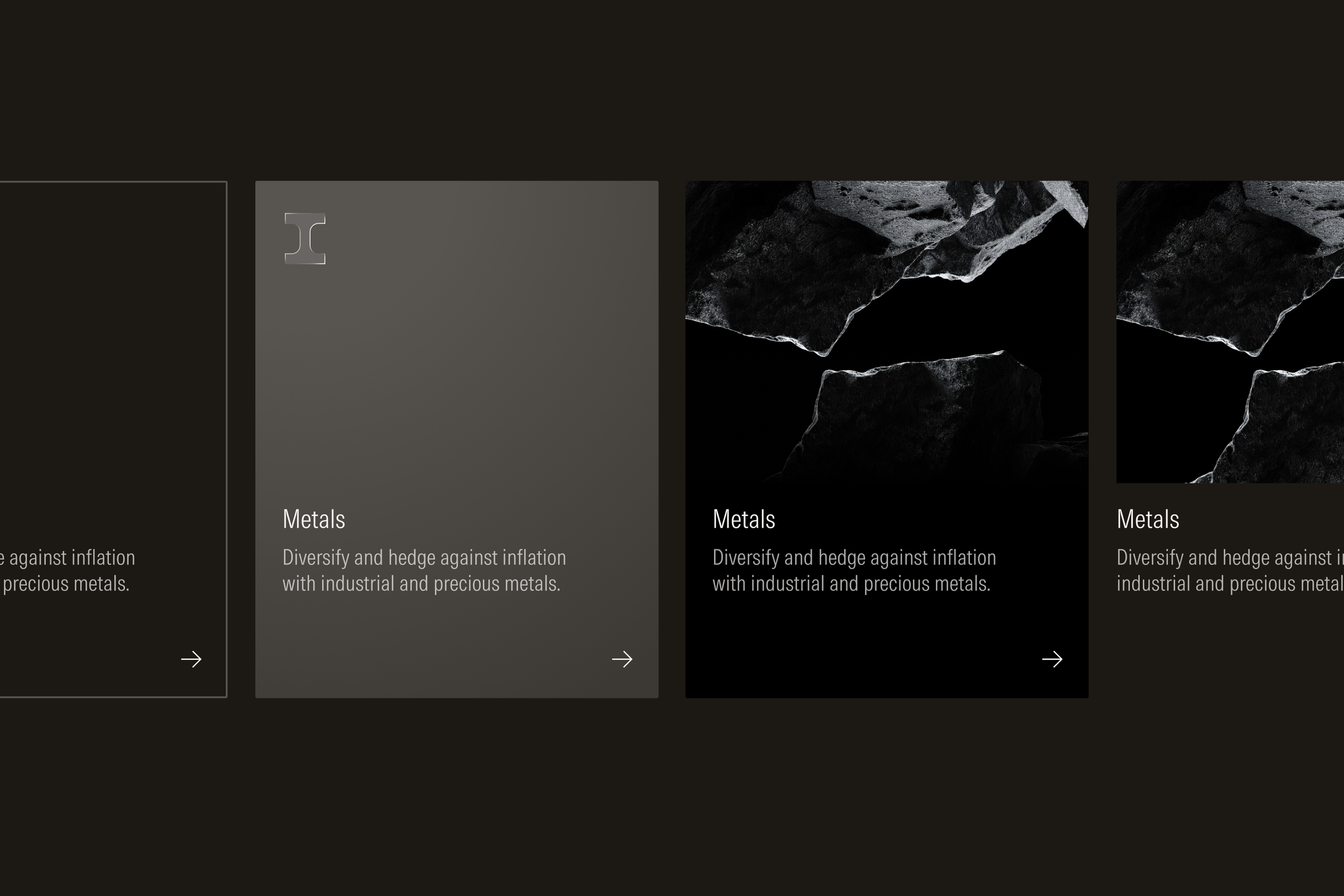
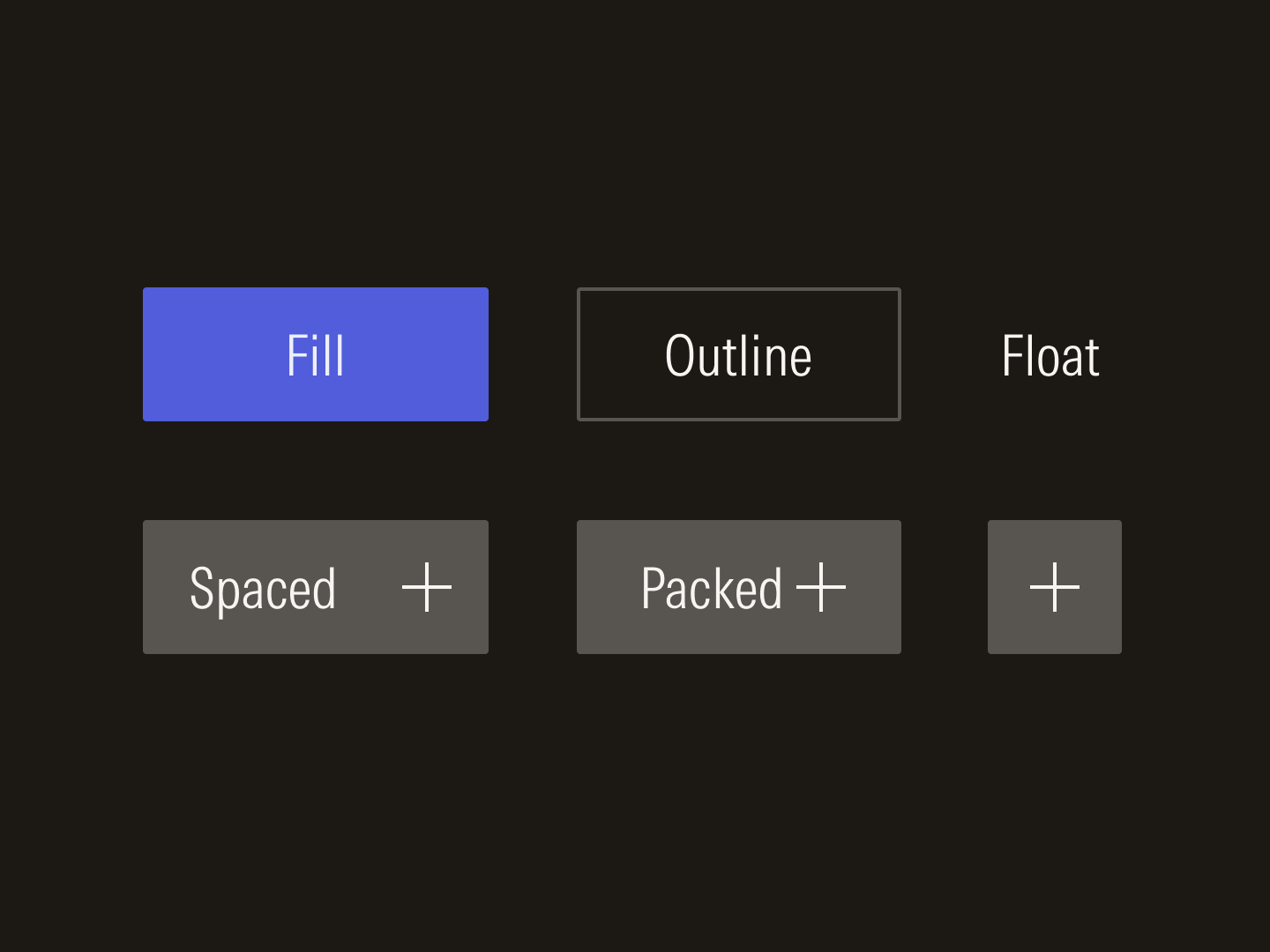
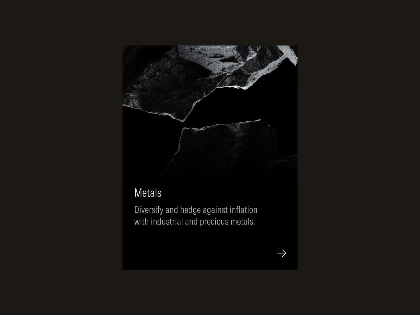
Cards are available in outline, fill, and float variants to support the diverse needs across product and marketing.
Card with vertical stack
Card with horizontal stack
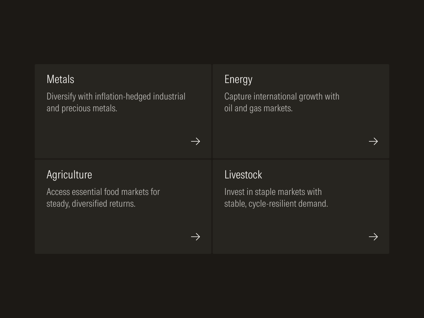
Packed grid
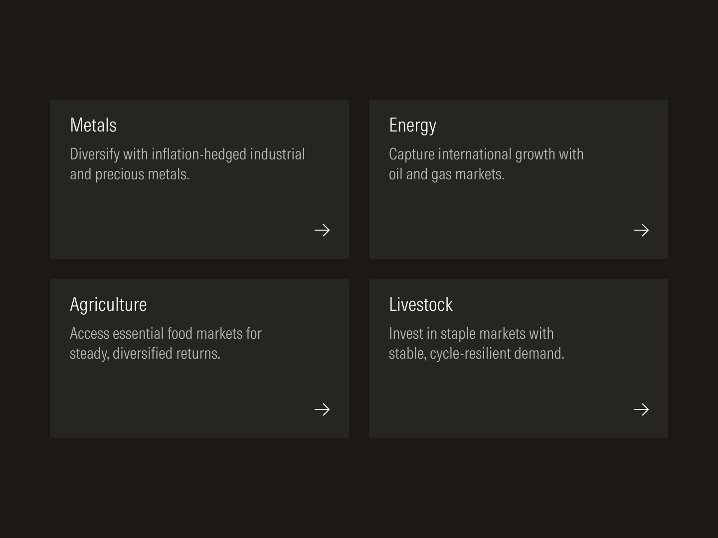
Spaced grid
In products, users perform a diverse set of tasks like navigating dashboards, analyzing investment data, or creating client reports. To most efficiently organize content-heavy screens and guide users through complex tasks, styles and components need to be chosen and assembled purposefully. When products are built in a predictable manner, their consistency builds trust and confidence.
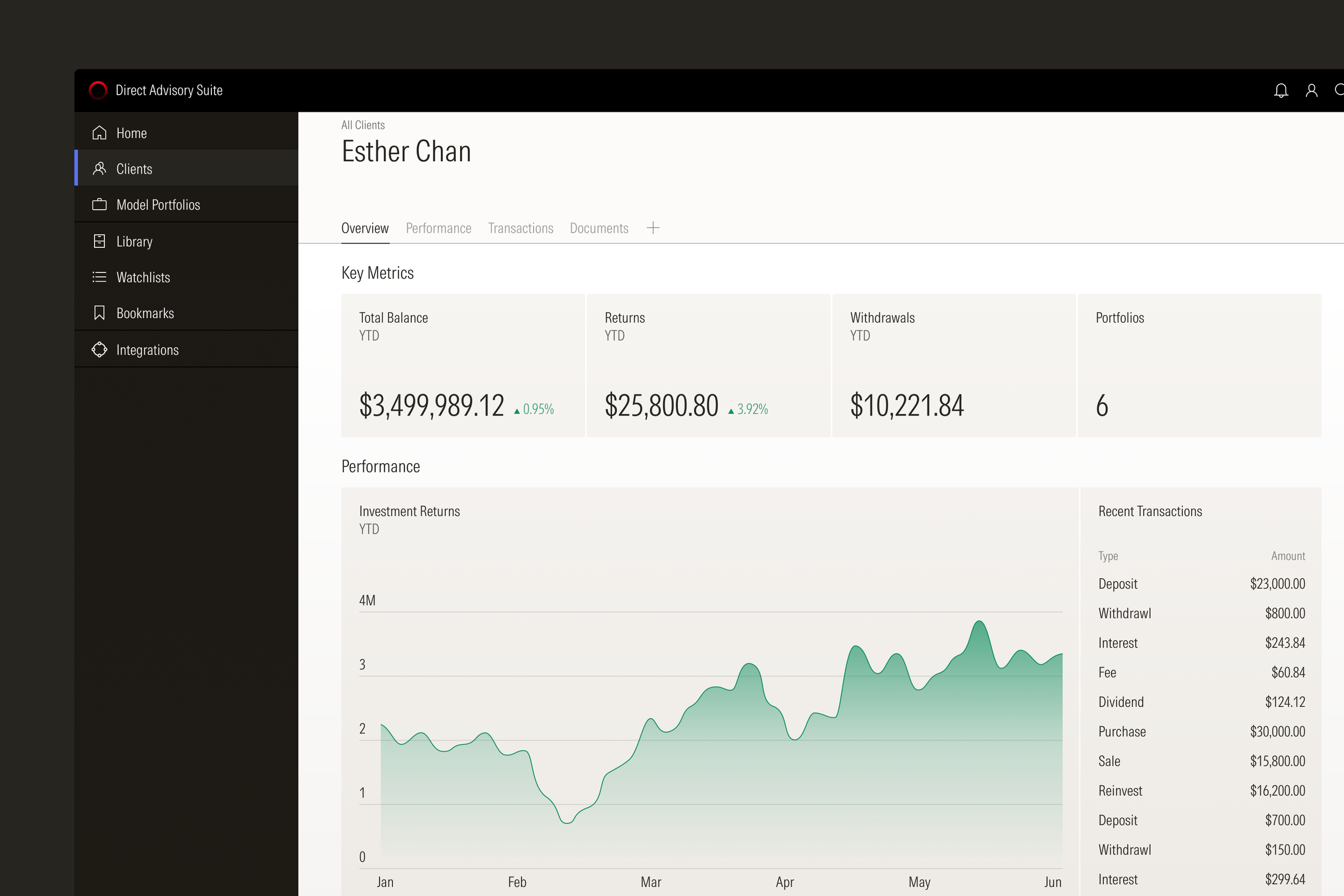
Product screens are organized in distinct zones to help users most efficiently navigate a screen or complete a task.
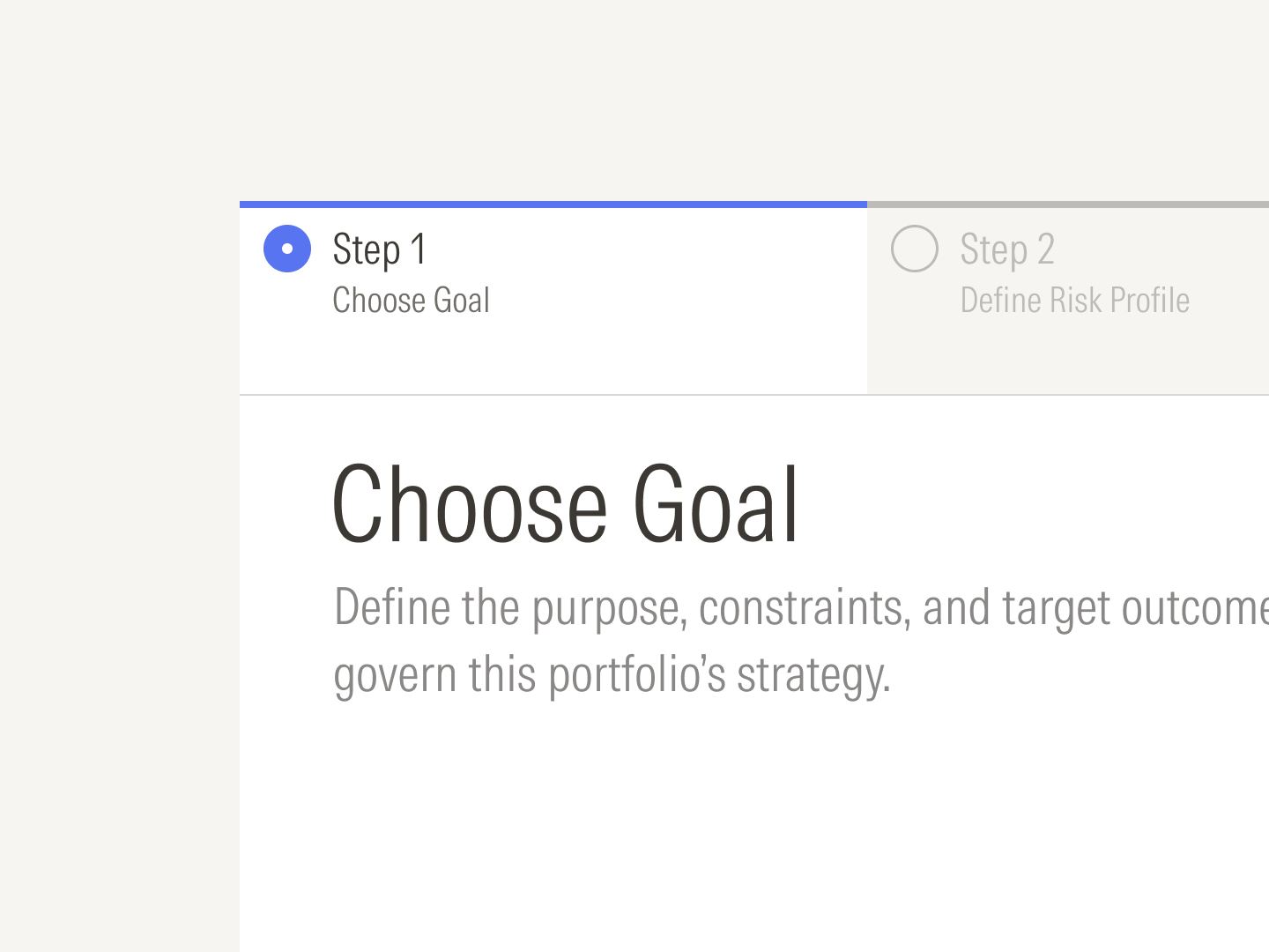
Steppers guide users through multi-step processes like client account or portfolio creation.
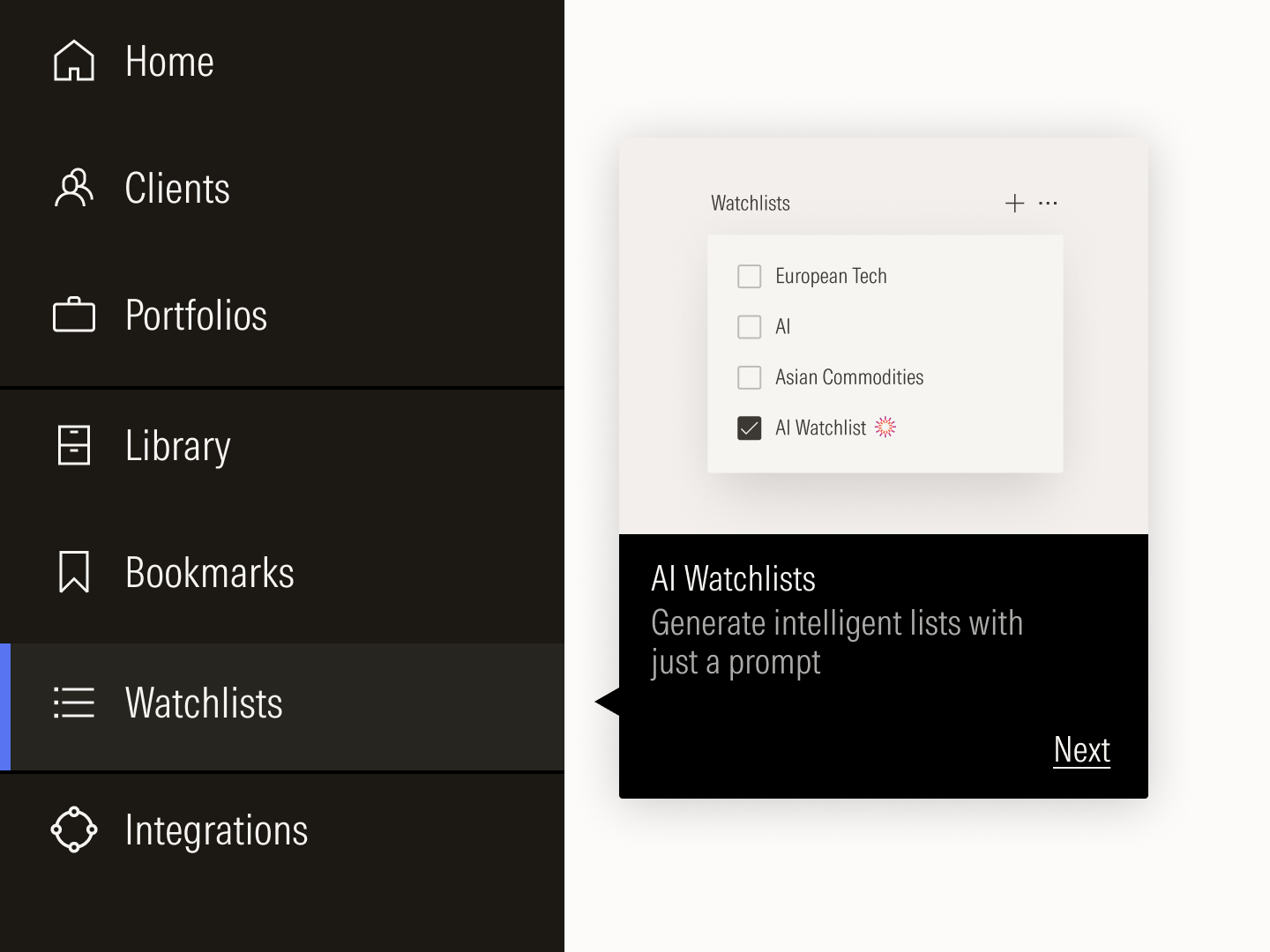
Rich tooltips help users discover new features in a product.
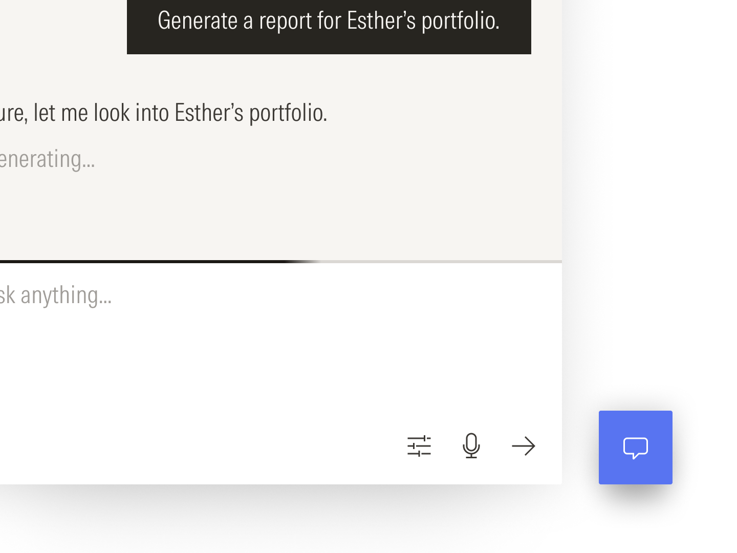
Individual components combine to form a pattern for chat interfaces.

Loaders combine with buttons to tie feedback directly to a user’s action.
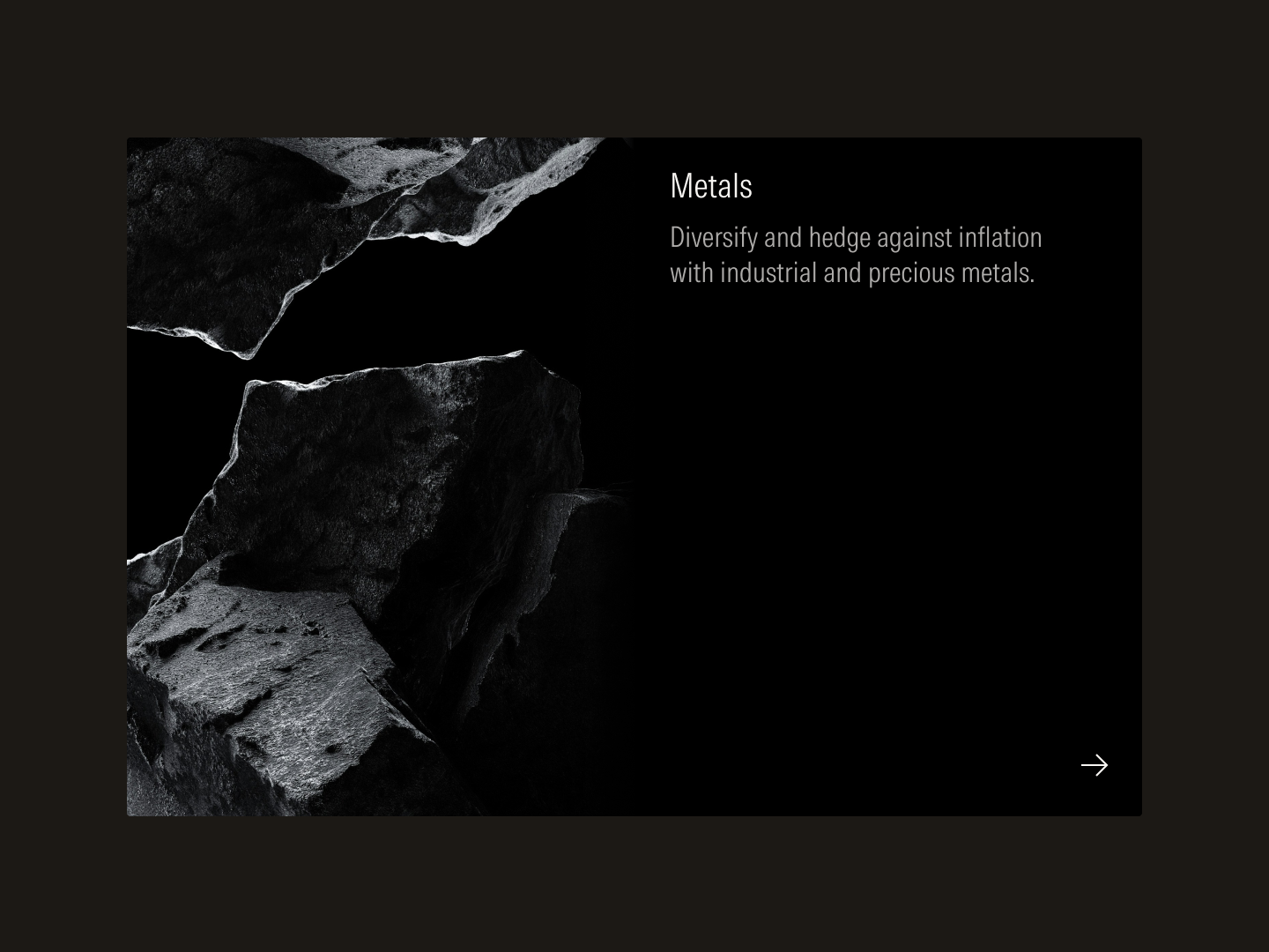
Whereas products demand restraint, marketing experiences open up the possibility to rich visual storytelling. More expressive variants of the same components used in product now bring color, texture, and depth to a marketing layout.

Components are chosen and composed for expressive storytelling rather than navigational efficiency or task completion.
Marketing experiences feature distinct patterns, like hero modules, feature rails, and persistent footers.
Gradient fills gives dimension and tactility to the card component.
Interactive gradients following cursor motion creates moments of delight.
Without documentation, a design system would remain a disorganized collection of components, tokens, and code. The documentation site showcases system components and patterns in use and serves as the authoritative repository and knowledge base designers and developers need. An artificial intelligence interface layer fed by site content and data help them navigate the guidance faster.
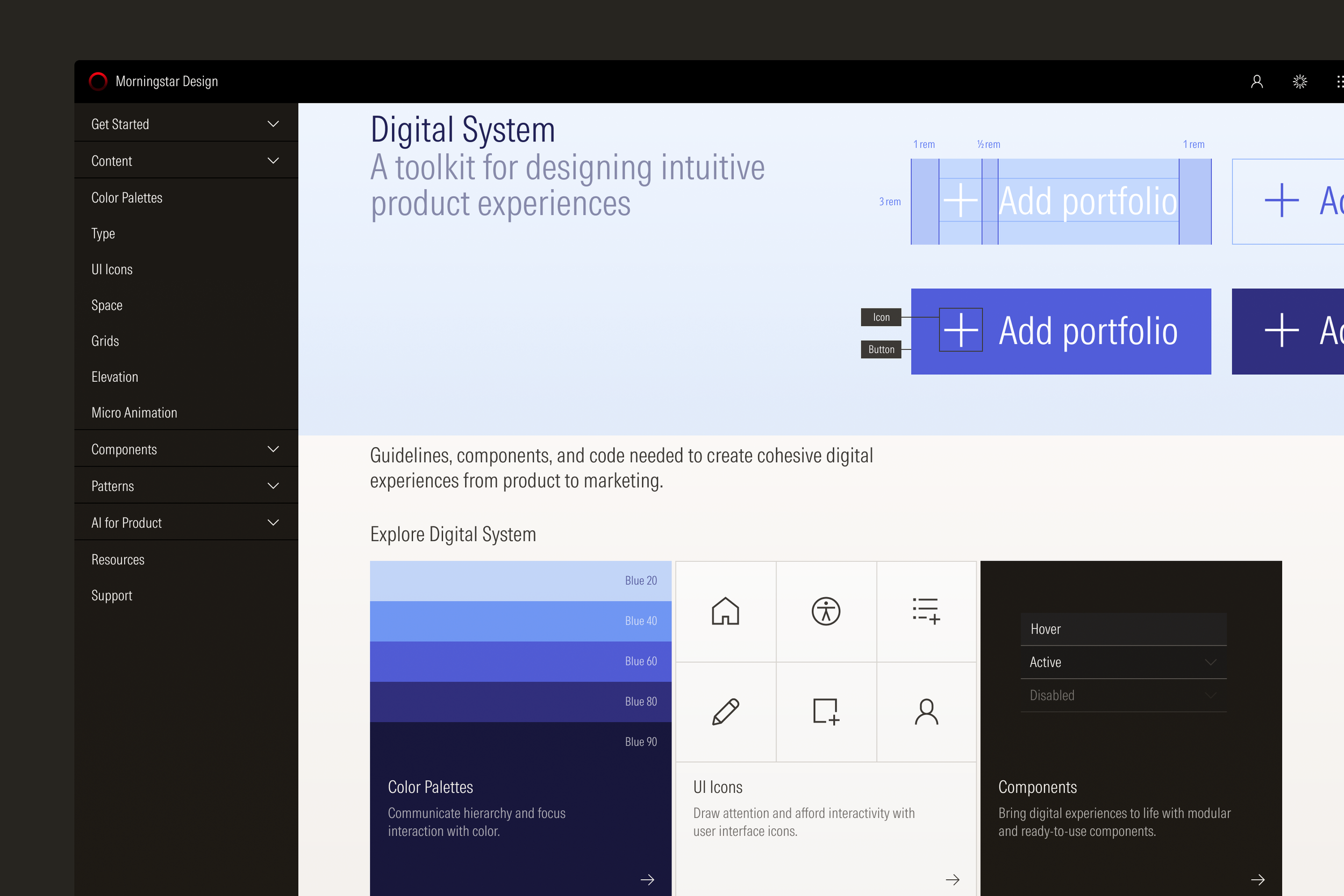
The documentation site draws on components and patterns to showcase the design system.
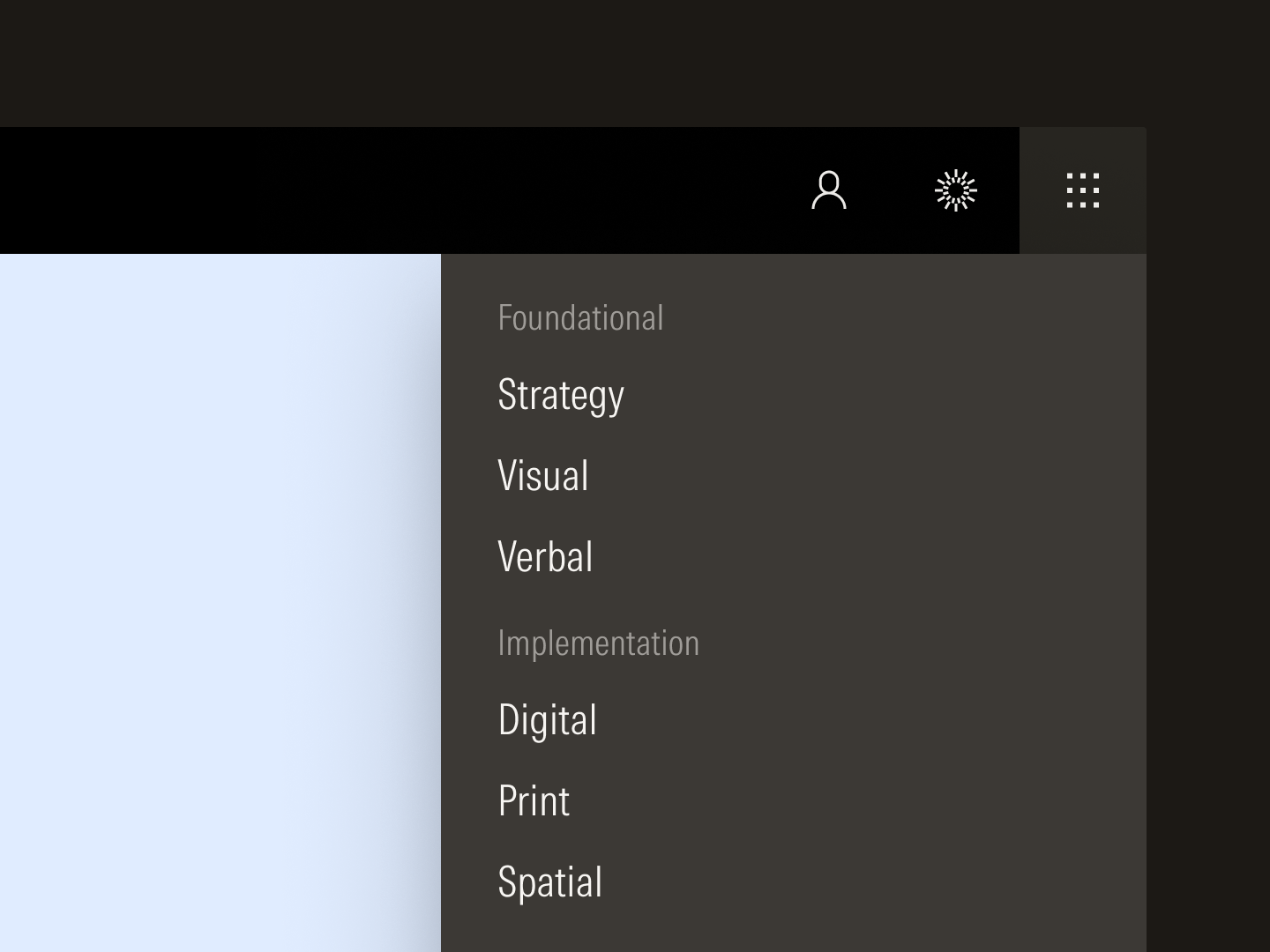
The digital system is part of a larger ecosystem of guidance that governs all aspects of design.
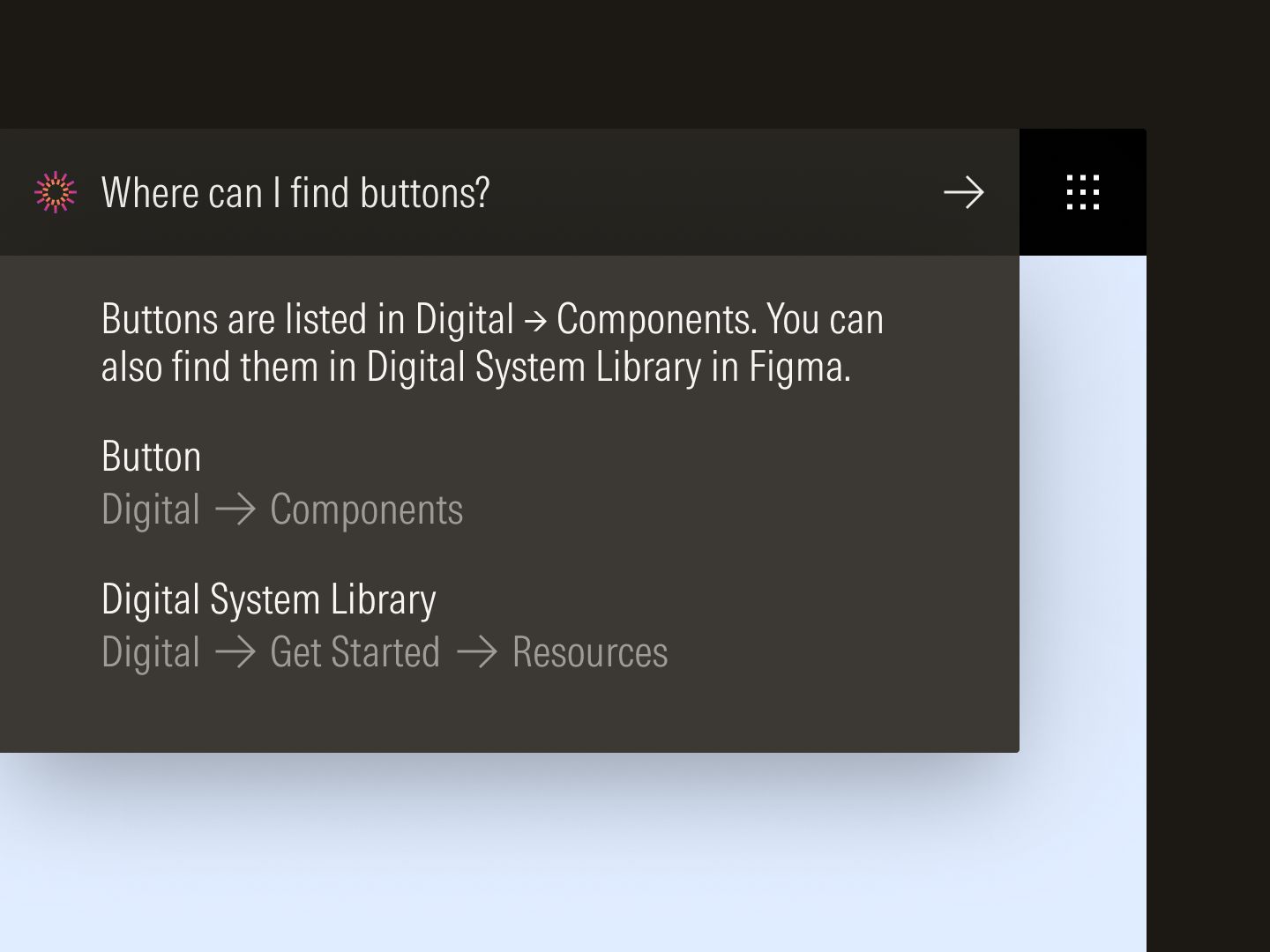
Machine-readable content and data on the site power AI-assisted search.
Design systems are important because they bring consistency, efficiency, and scale to products and teams. They become especially critical for complex, mission-driven organizations with large digital footprints. As technology and economies evolve, so do the challenges investors face and the needs they have. With this design system, Morningstar is uniquely equipped to respond to shifting industry trends or business priorities without losing sight of its mission to empower investor success for the foreseeable future.
Icons drawn by Jonathan Petersen. Morningstar Intrinsic drawn and developed by Lineto.
More information can be found on the documentation site.
Brand Identity
Content Design
Systems Design
Visual Design